

LOGOFOLIO
SUMMARY:
Here you'll find a curated selection of my logo designs, each showcasing the creativity and care I put into every project. Every section goes beyond the logos themselves, offering insights into the process and visualizations of each logo's construction. You'll also see examples of colors, patterns, and other elements that show how each logo fits within its broader identity.
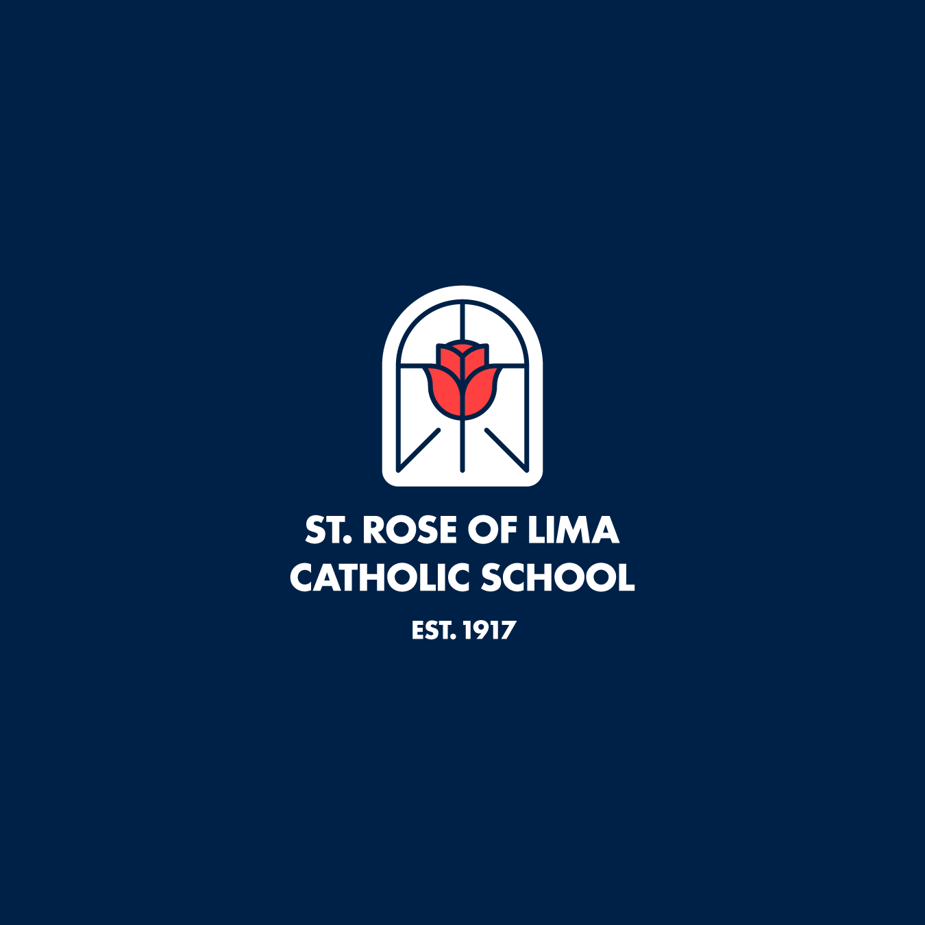
01. ST. ROSE OF LIMA
St. Rose of Lima is a Catholic elementary school “dedicated to nurturing a relationship with Jesus, promoting academic excellence, and fostering leadership through service to prepare responsible, compassionate citizens.”
For the logo, I chose a stylized rose as the main visual element, framed within an arched window to reflect the iconic windows of the school's church. I also incorporated a cross, a book, and a path to symbolize the school's religious foundation, commitment to knowledge, and guidance for students.
I selected Futura for the wordmark, a classic typeface that balances simplicity and elegance. The bold weight, paired with the Oxford Blue color palette, conveys confident professionalism while remaining approachable.
SYMBOL:

APPLICATION:
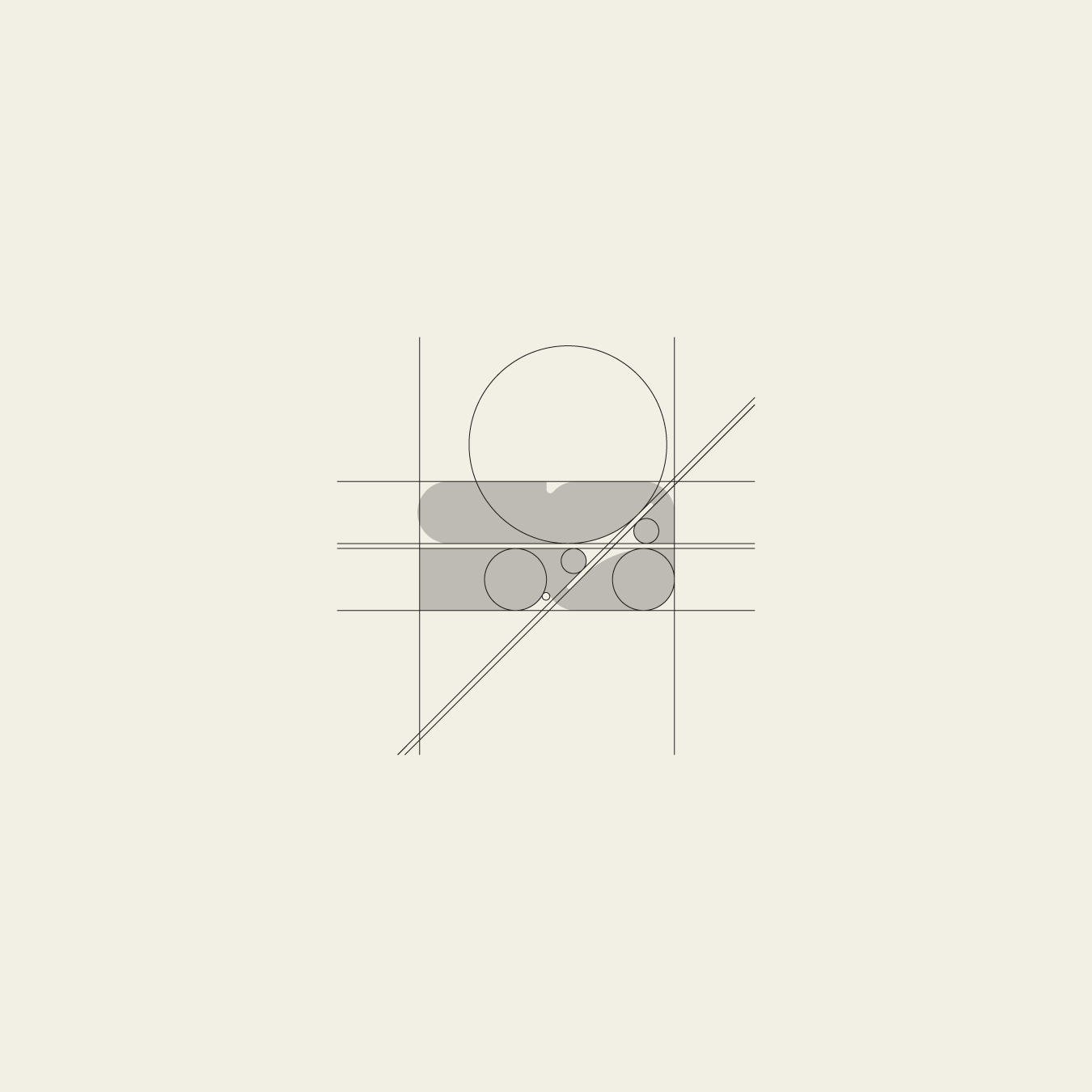
CONSTRUCTION:

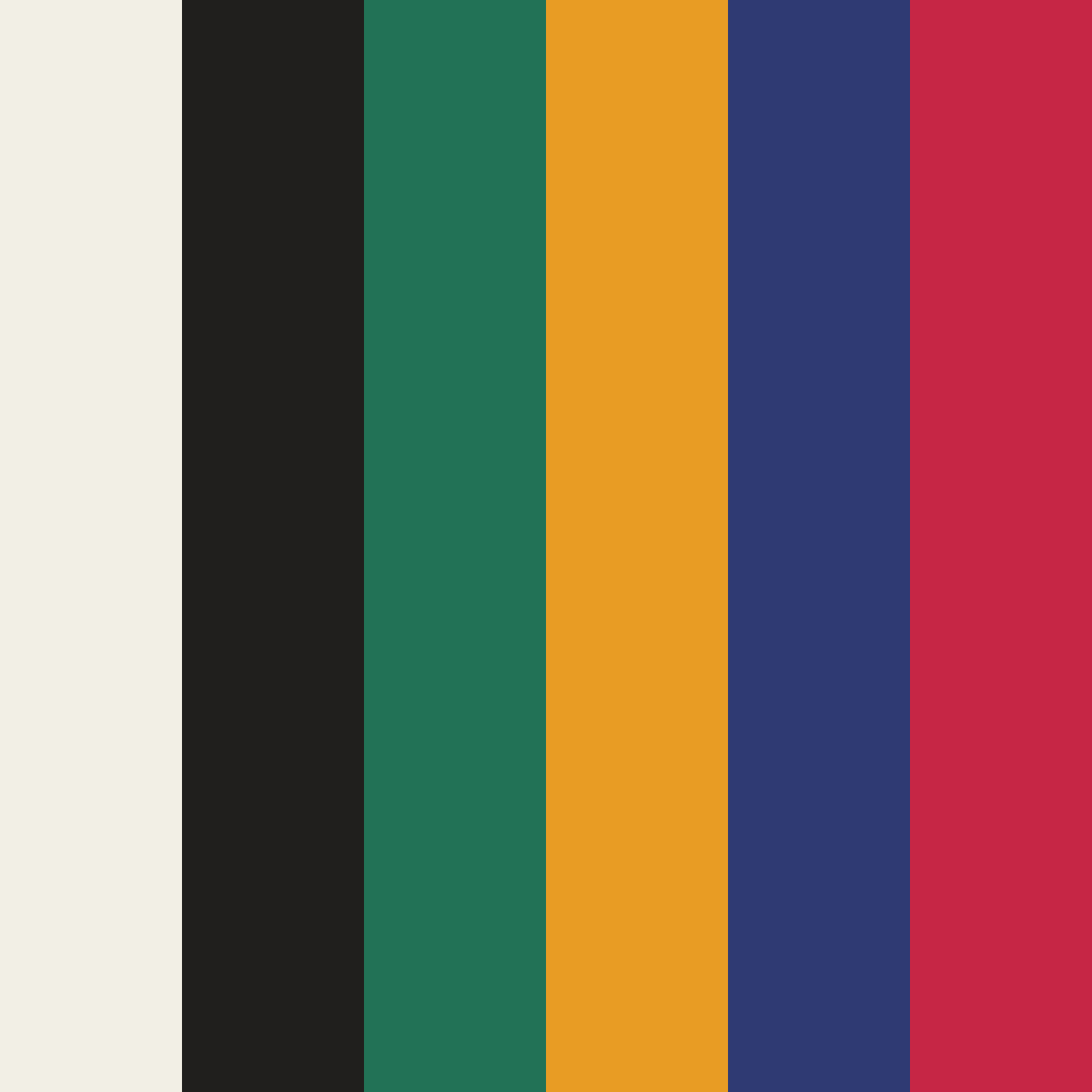
COLOR PALETTE:

LOCKUP 01:
LOCKUP 02:

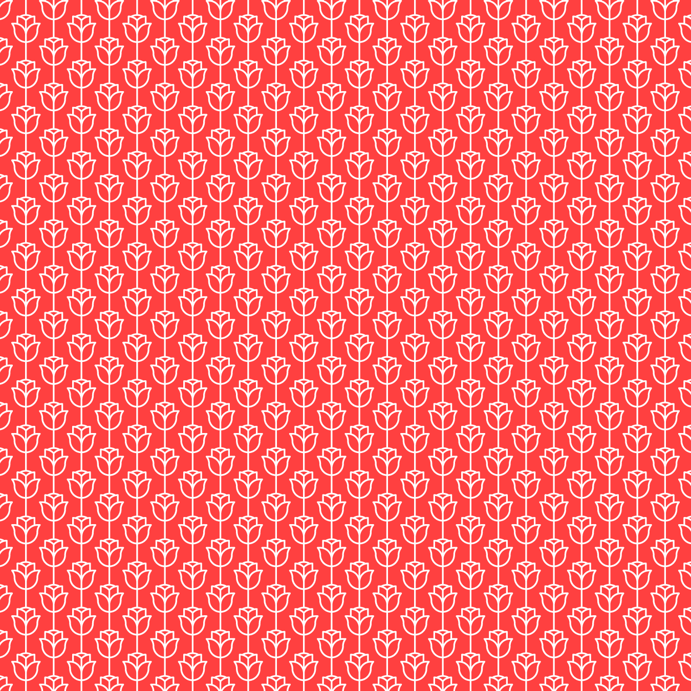
PATTERN:
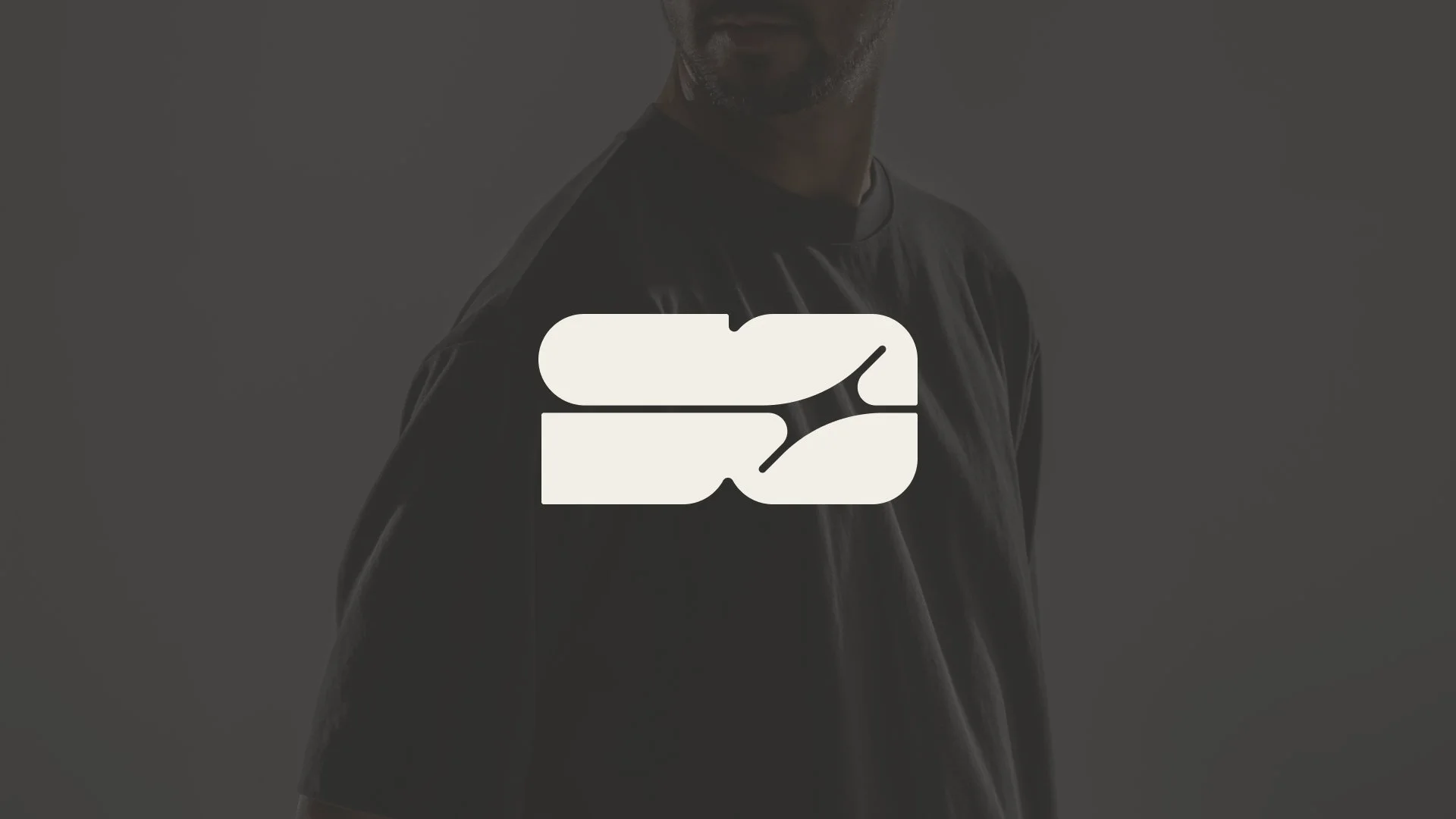
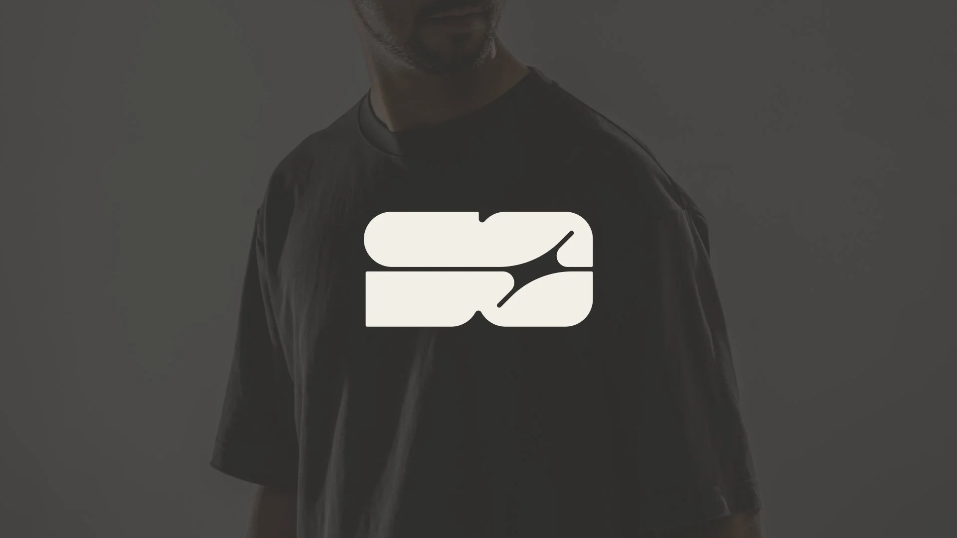
02. Sean Oulashin
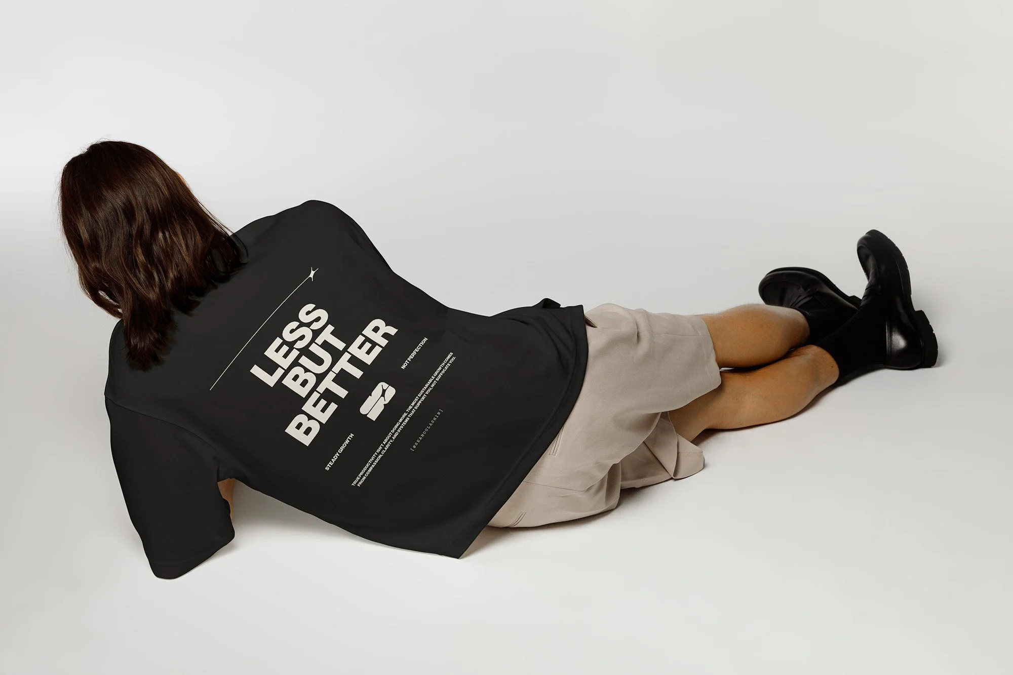
Sean is a digital creator focused on optimization, constantly refining his approach to productivity, mental health, and goal-setting.
I built the logo system around a geometric symbol that merges his initials (“S” and “O”) with a spark, a simple nod to the idea of process leading to clarity. The wordmark is set in Neue Haas Grotesk with tight kerning that creates subtle connections between letterforms.
The spark extends beyond the logo as a flexible graphic motif, allowing the brand to show up without always relying on the full mark. A custom pattern derived from the spark adds some extra depth across applications.
SYMBOL:
APPLICATION:
CONSTRUCTION:
COLOR PALETTE:
PRIMARY LOGO LOCKUP:
THE SPARK:

PATTERN:

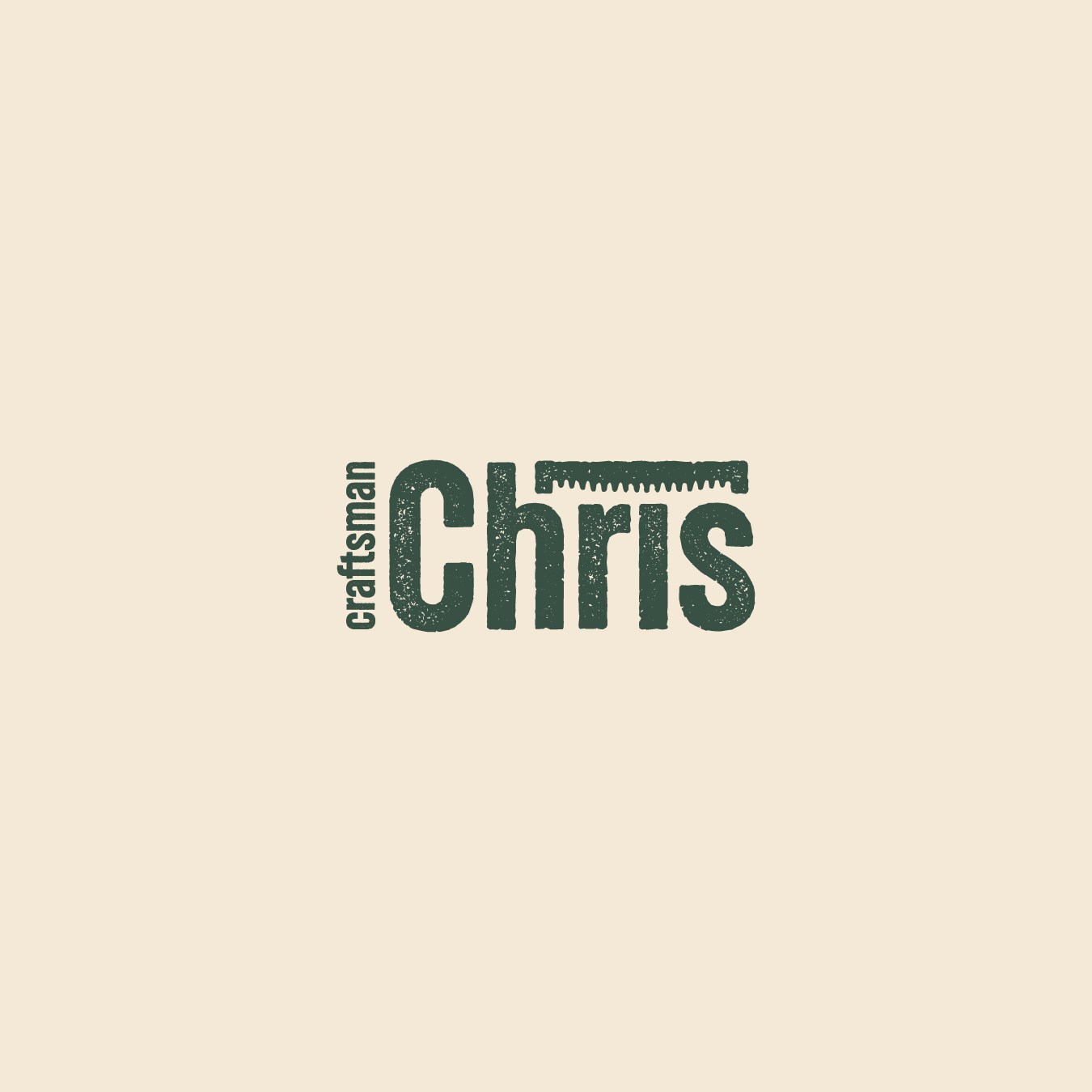
03. CRAFTSMAN CHRIS
Craftsman Chris is an independent content creator who shares outdoor construction projects on YouTube.
For his logo, I aimed for that rustic, handmade vibe. I chose a textured font and added a sawdust-inspired texture for extra depth. The saw icon, designed in the same rugged style, adds to that vibe. Stacking the type and icon gives it a balanced and structured look.
As for colors, I took cues from the woods for that natural feel. I also made a simplified version of the logotype for social media use.
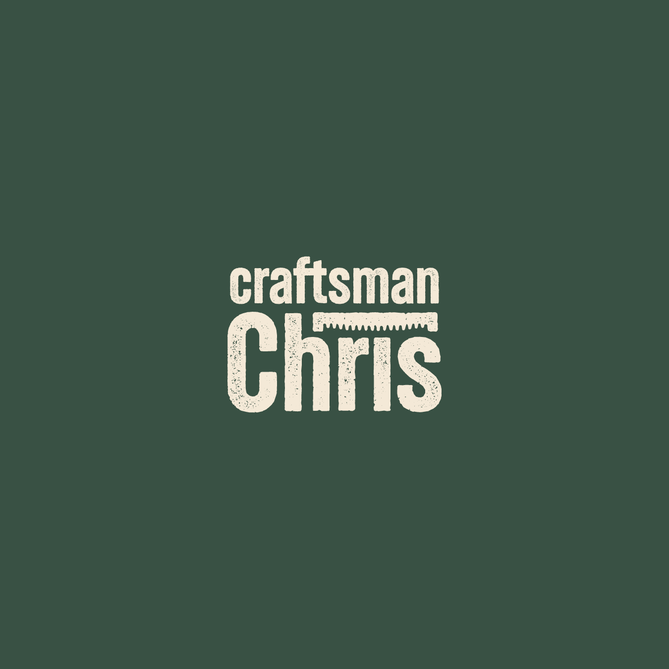
LOGOTYPE:

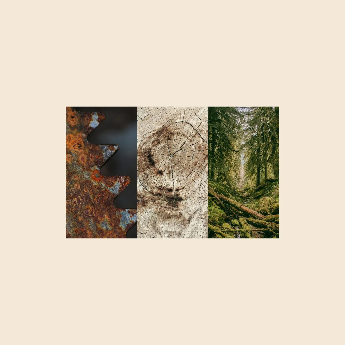
INSPIRATION:
CONSTRUCTION:

COLOR PALETTE:

LOGOTYPE 01:
LOGOTYPE 02:
SUBMARK:

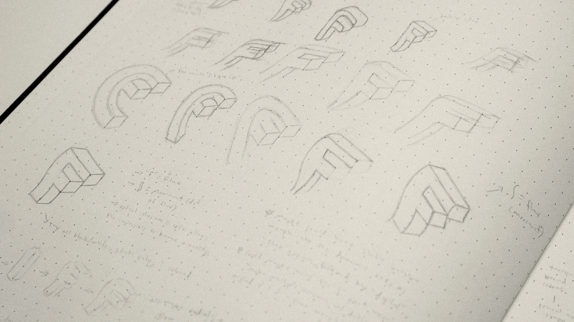
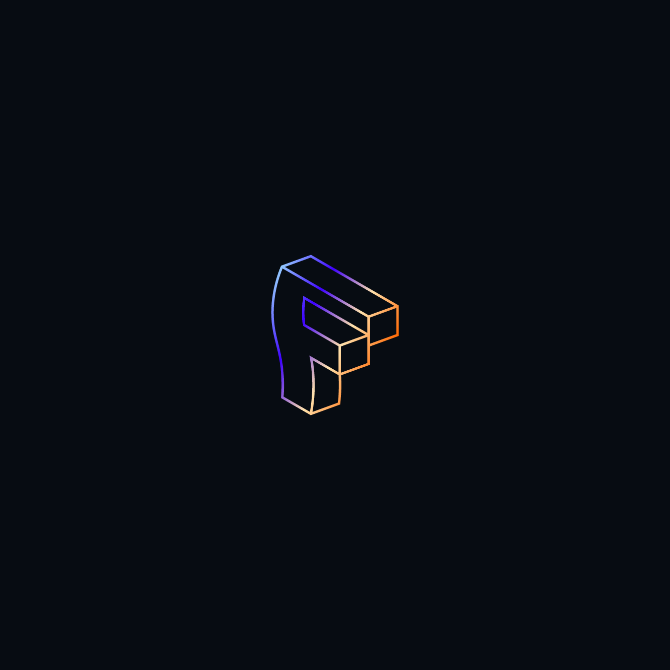
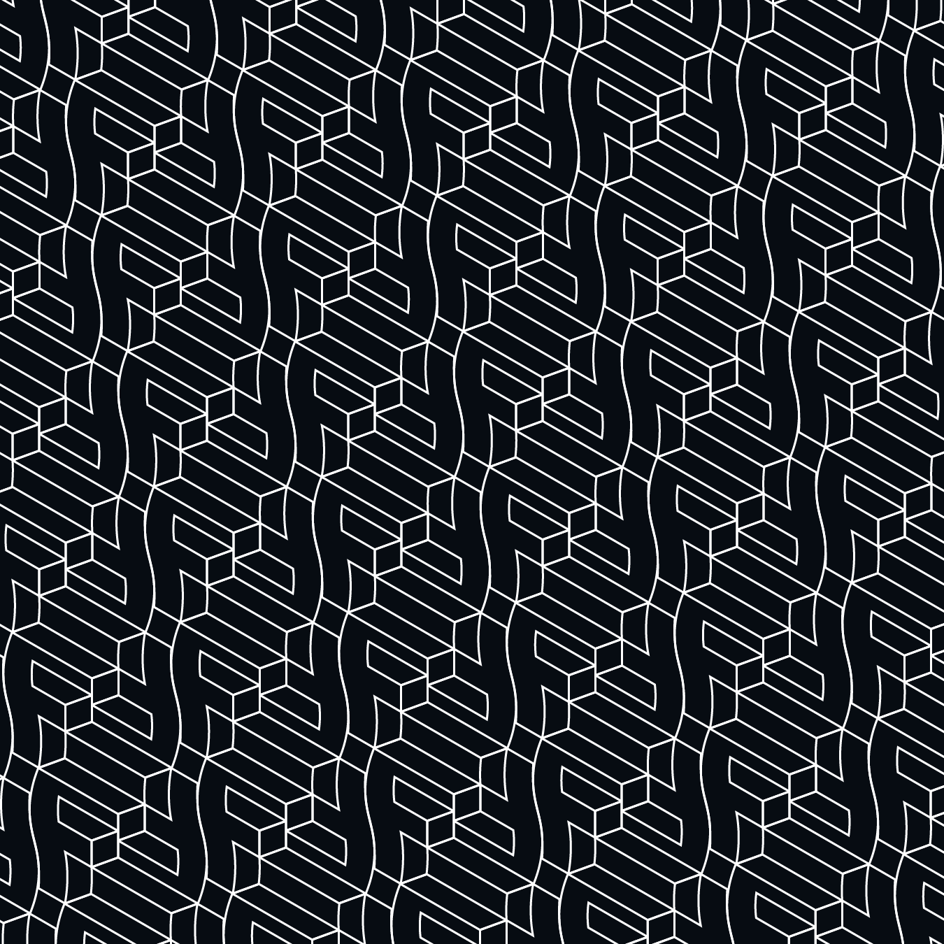
04. FLUX DIGITAL
Flux Digital is a fictional online conference and community dedicated to helping new filmmakers dive into the world of digital effects in film.
For the logo, I wanted to capture the idea of bringing the impossible to life—a key feature of digital effects. I utilized the letter "F" to symbolize flux, film, and VFX, crafting an optical illusion that represents how digital effects can make the impossible a reality.
The symbol is brought to life with a vibrant palette of complementary colors, a custom wordmark, and a pretty rad pattern (if I do say so myself).
SYMBOL:

SKETCHING:
CONSTRUCTION:

COLOR PALETTE:

SYMBOL:
LOCKUP:

PATTERN:
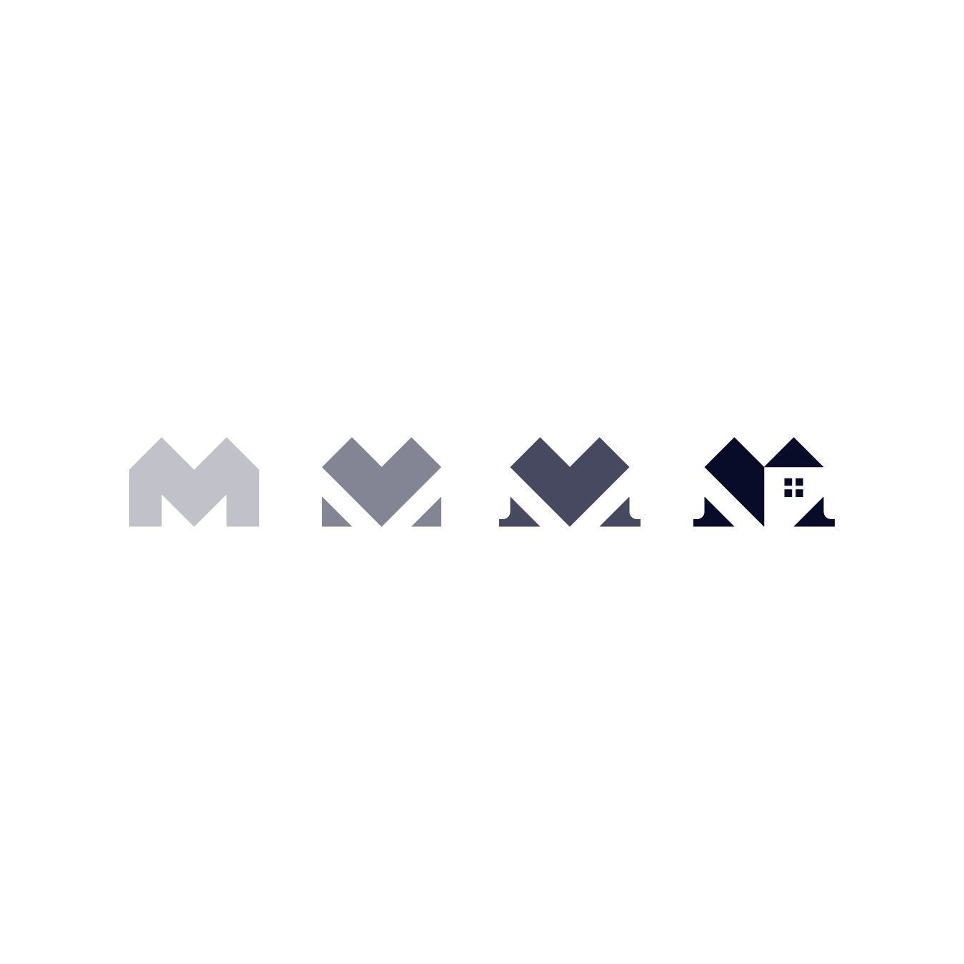
05. MGF EQUITY GROUP
MGF Equity Group is a team of real estate professionals focused on helping families become homeowners and secure their financial futures.
For the logo, I wanted a symbol that communicates sophistication, trust, and professionalism. By merging the letter "M" with a home icon, I was able to represent their industry and honor the founder's initial—a simple yet effective solution.
The blue monochromatic palette and serif wordmark further enhance the visual identity, helping to communicate trust and sophistication.
SYMBOL:

EVOLUTION:
CONSTRUCTION:

COLOR PALETTE:

SYMBOL:

LOCKUP:

PATTERN:

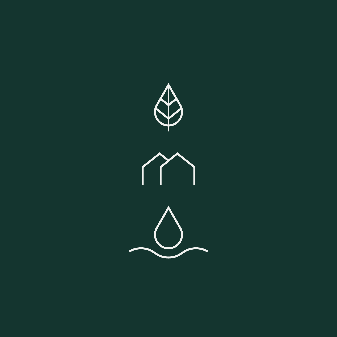
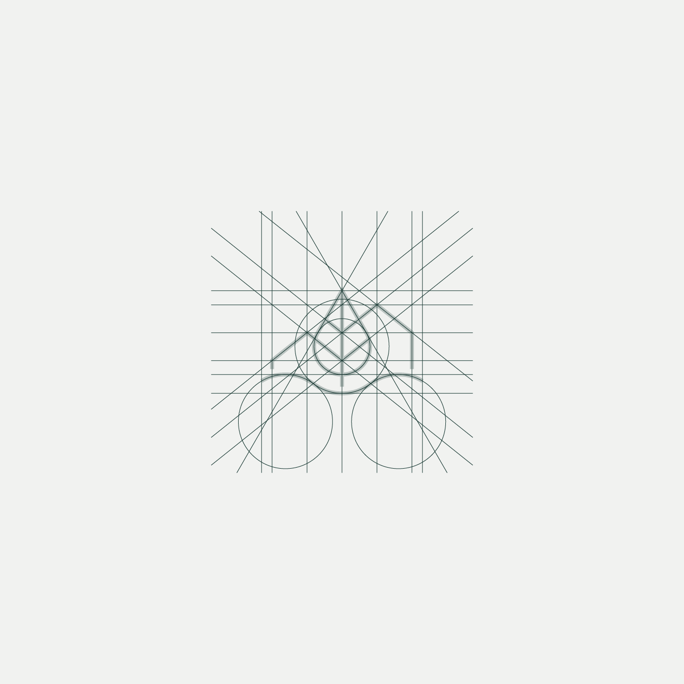
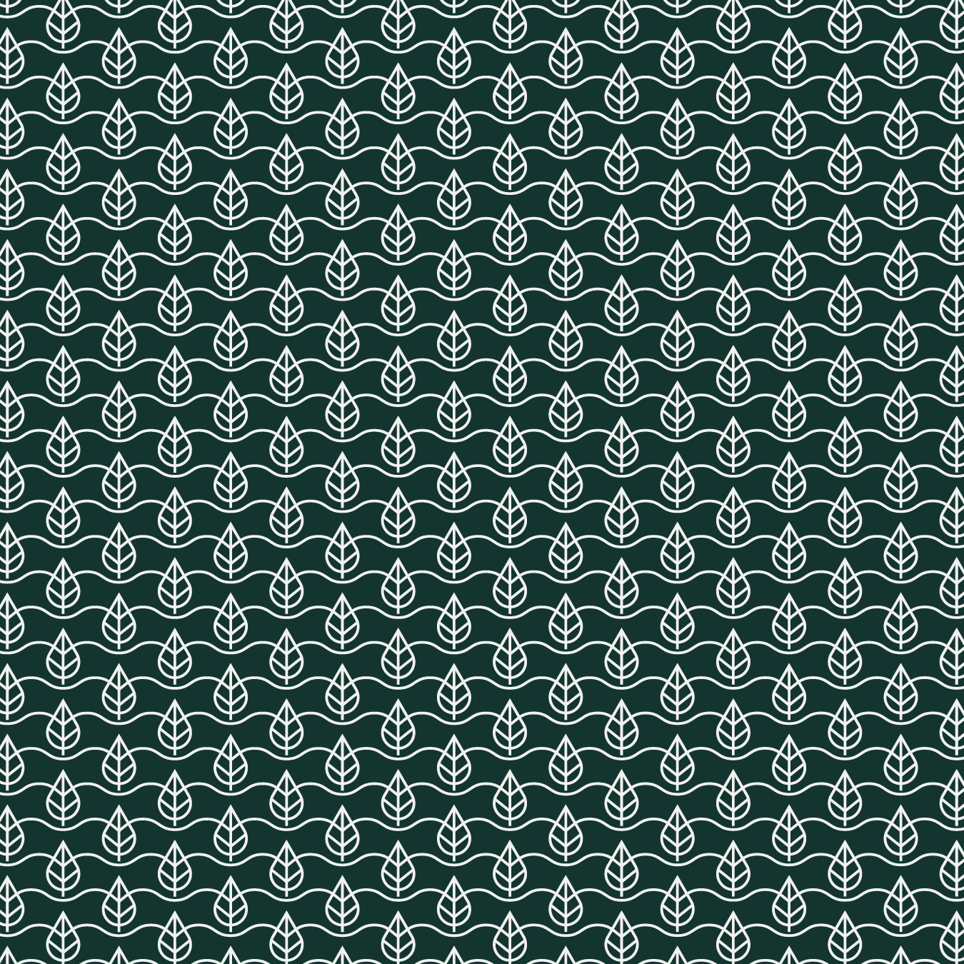
06. ELLIS LANDING
Ellis Landing is an upscale mobile home park located in western Michigan, bordered by large bodies of woods and water.
To capture these natural elements, I created a symbol blending outdoor living with mobile home comfort, combining a tree, water, and mobile home into one unified visual element.
The symbol is complemented by a muted green palette, providing a sense of harmony with nature. The uppercase, generously spaced wordmark adds a touch of class, helping to communicate their upscale living.
ACKNOWLEDGMENTS:
Creative Direction — Bree & Ross Tanner, Studio Us
SYMBOL:

SYMBOL ELEMENTS:
CONSTRUCTION:
COLOR PALETTE:

LOCKUP 01:

LOCKUP 02:

PATTERN:
LAST LOOK
EXPLORE MORE
CALDER PLAYING CARDS
01. Back Design
02. Pips/Values
03. Aces
04. Court Cards
05. Assembly/Prepress