
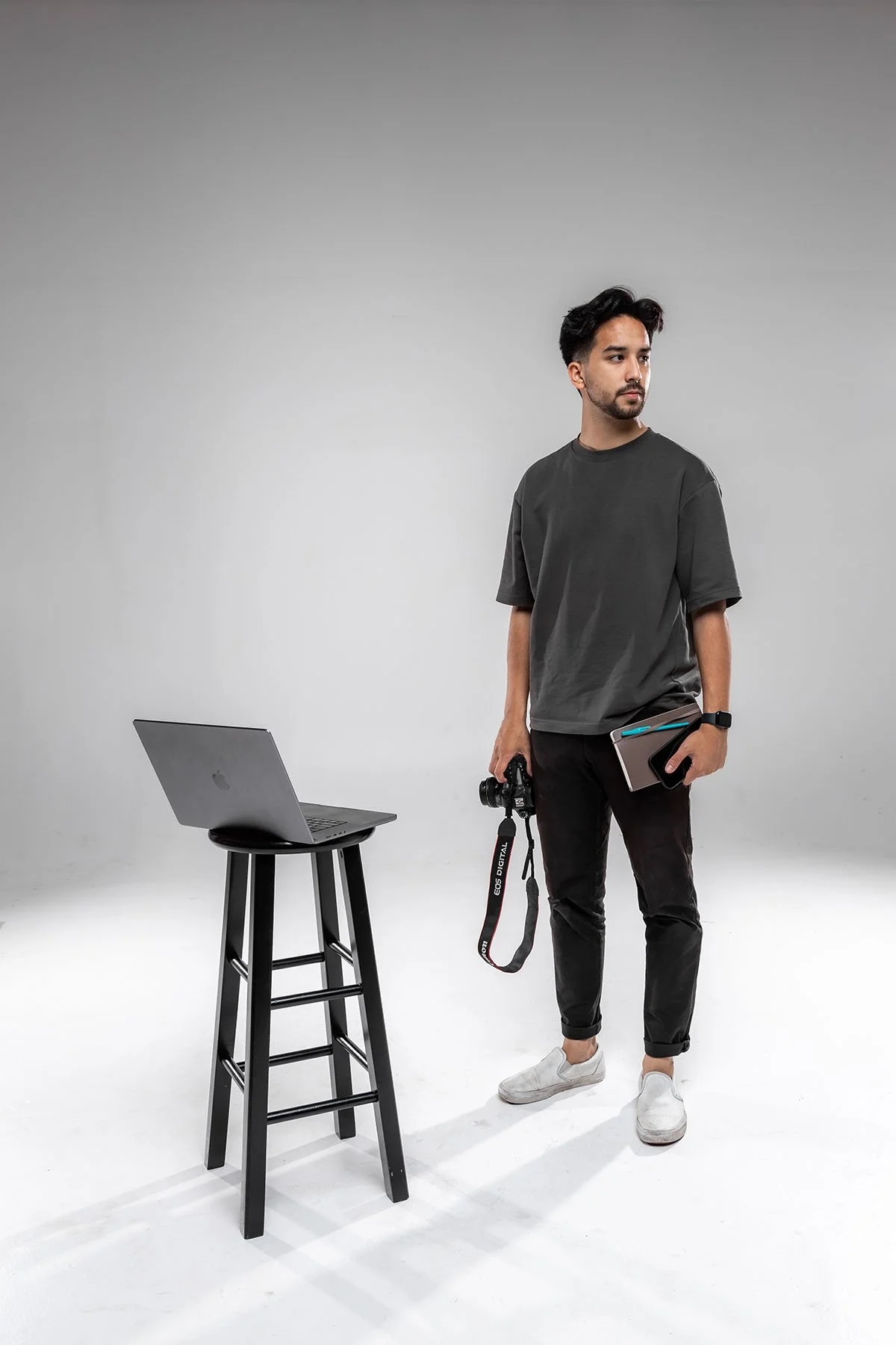
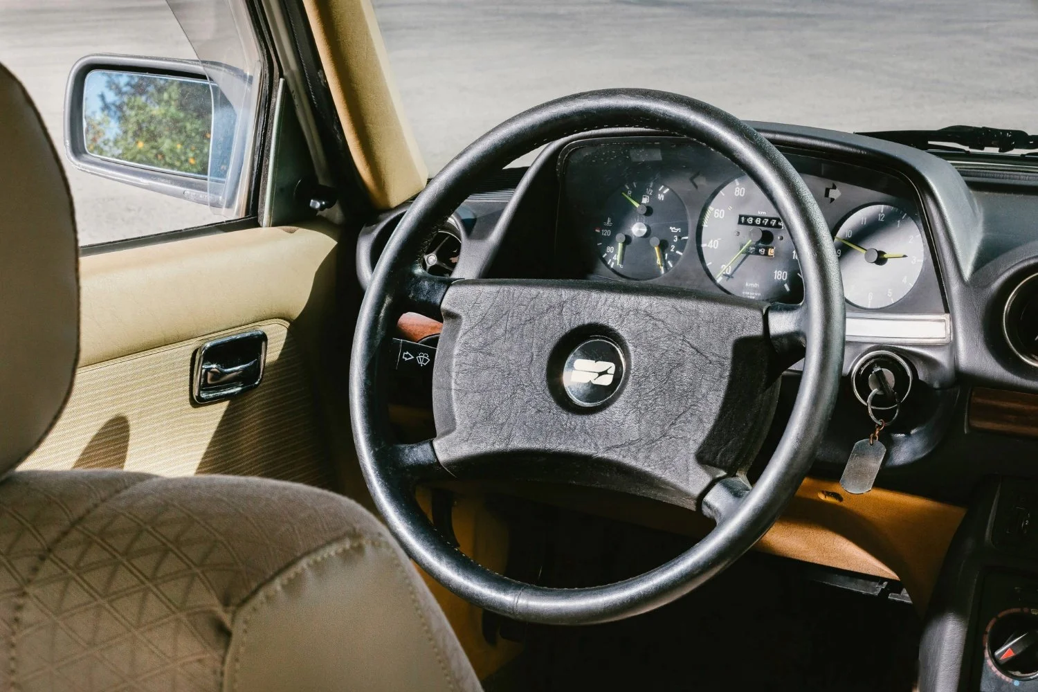
SEAN IN HIS NATURAL HABITAT:
PREVIOUS IDENTITY:

sean Oulashin Branding
THE ASK:
Sean needed an updated brand identity that reflected his evolving aesthetic and long-term vision, a system that felt intentional, refined, and future-focused.
BACKGROUND:
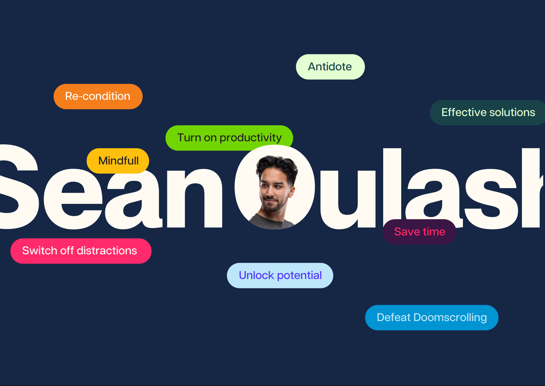
Sean Oulashin is digital creator driven by optimization, constantly refining how he approaches productivity, mental health, and goal-setting. His content often challenges people to stop scrolling, step away from screens, and to live and work more deliberately. The brand needed to reflect that mindset: focused, thoughtful, and built around clarity.
SUMMARY:
The final identity blends utilitarian structure with a tactile, editorial sensibility. Subtle paper textures, book-inspired layouts, and restrained typography create a feeling that contrasts the digital noise Sean often critiques. The result is a system that feels intentional and grounded, encouraging presence over distraction.
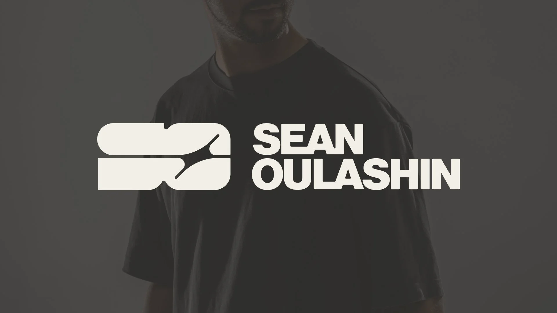
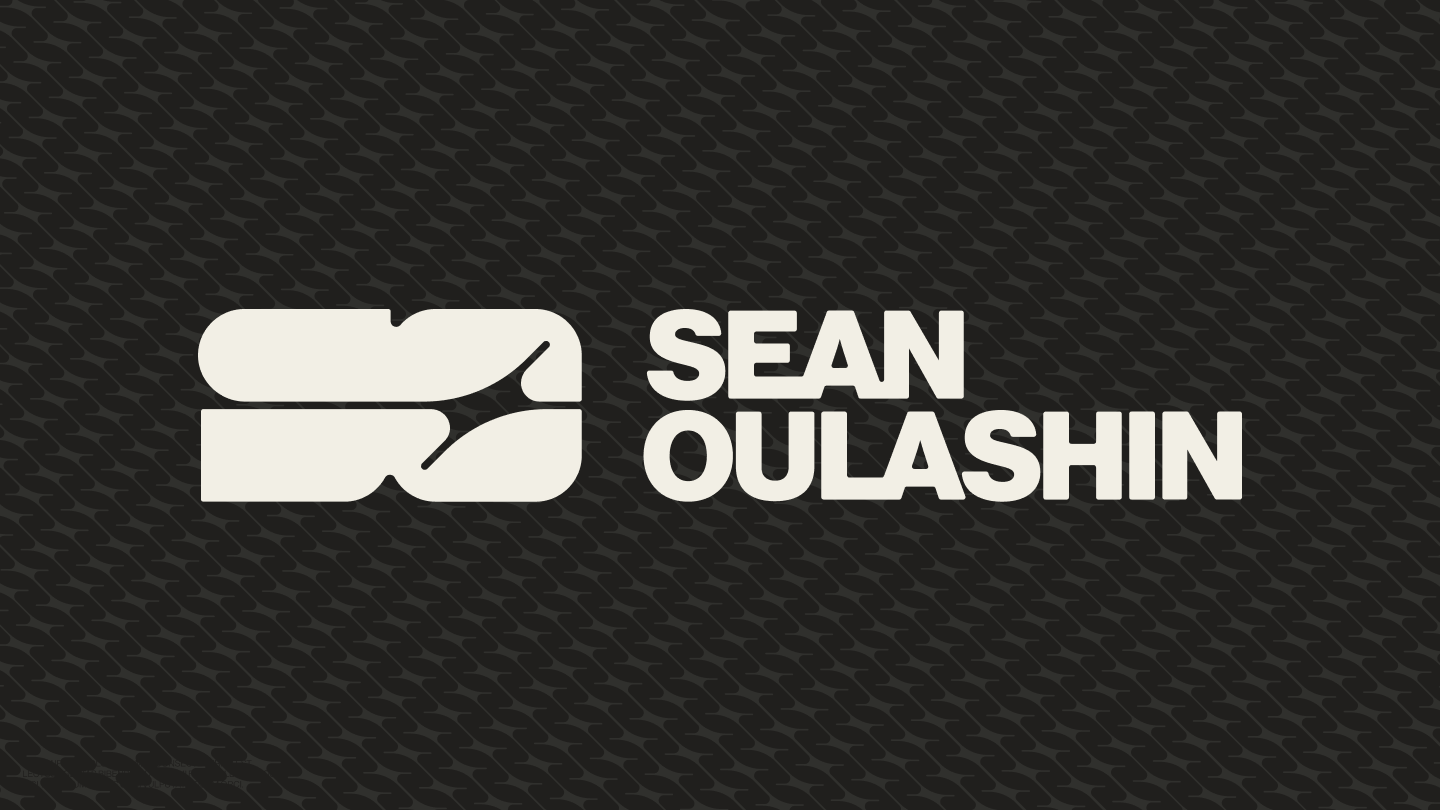
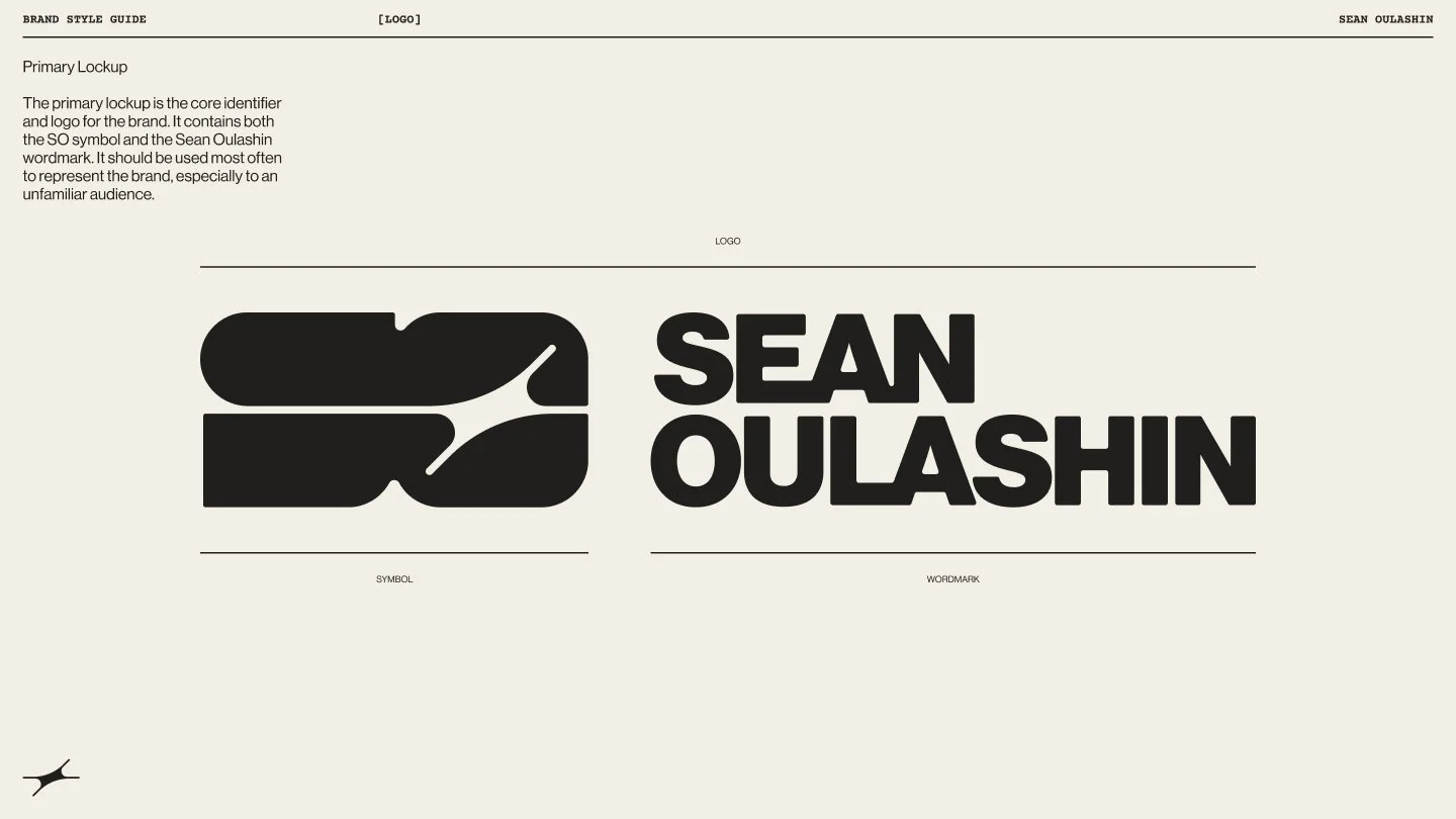
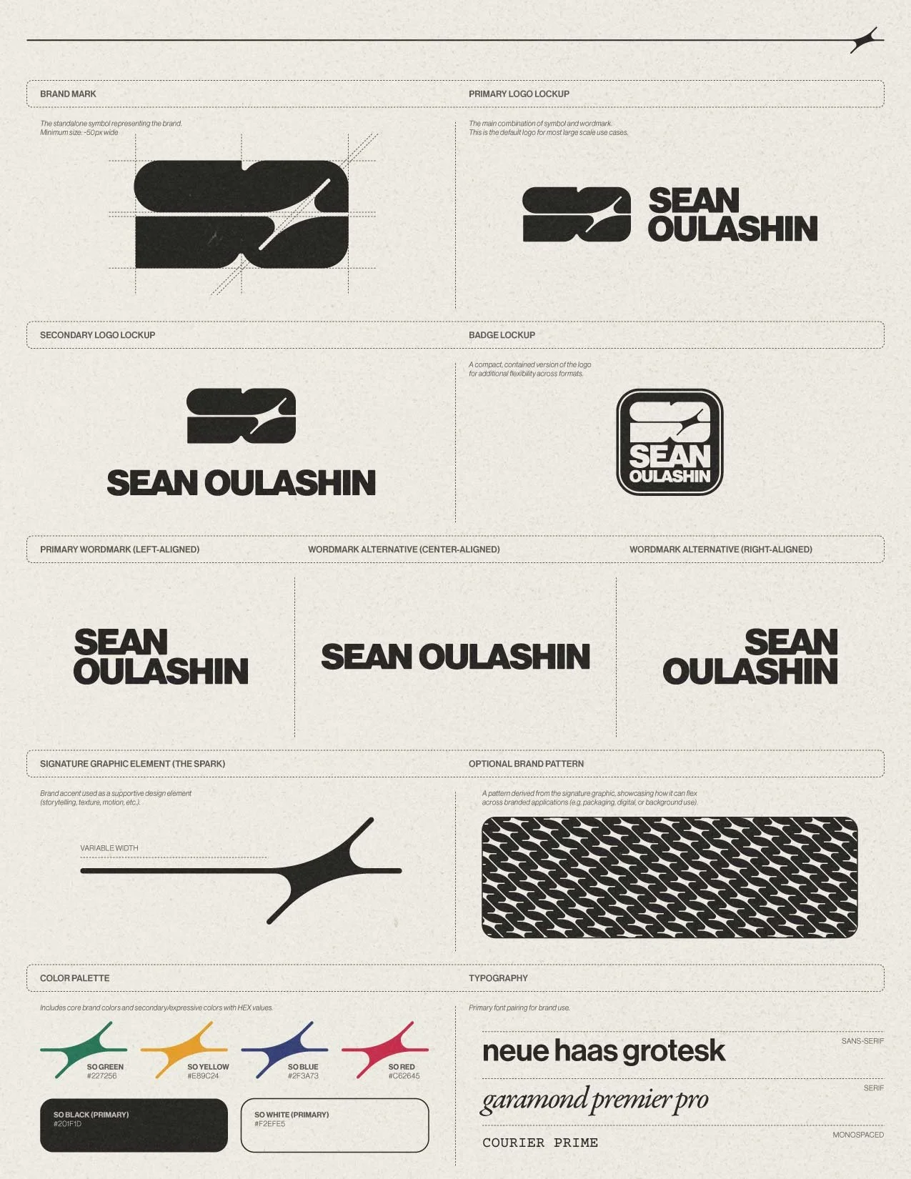
01. LOGO
The logo system is built around a geometric symbol that merges Sean’s initials (“S” and “O”) with a spark, a simple nod to the idea of process leading to clarity.
The wordmark is set in Neue Haas Grotesk with tight kerning that creates subtle connections between letterforms. Slightly rounded corners soften the overall feel and mirror the geometry of the brand mark.
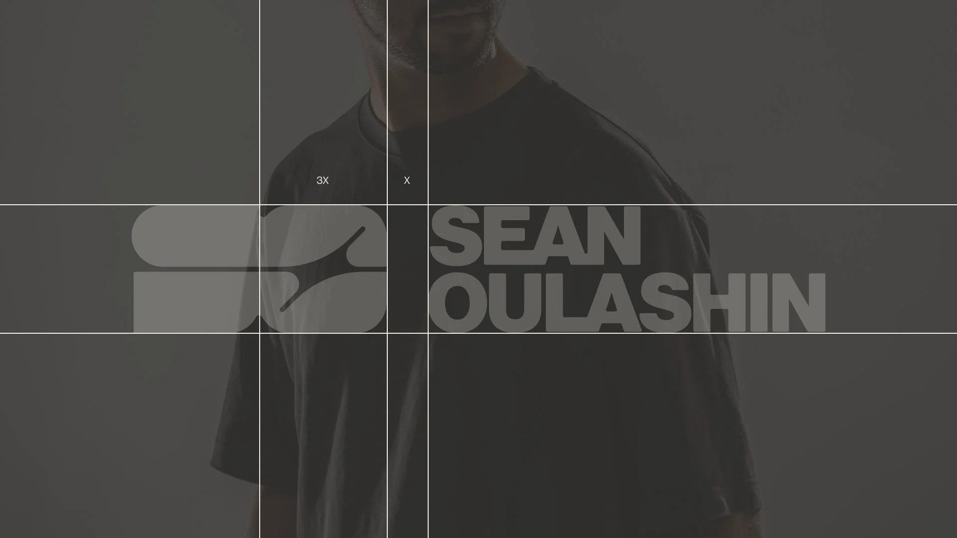
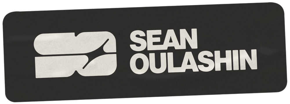
PRIMARY LOGO LOCKUP:

LOCKUP SPACING:
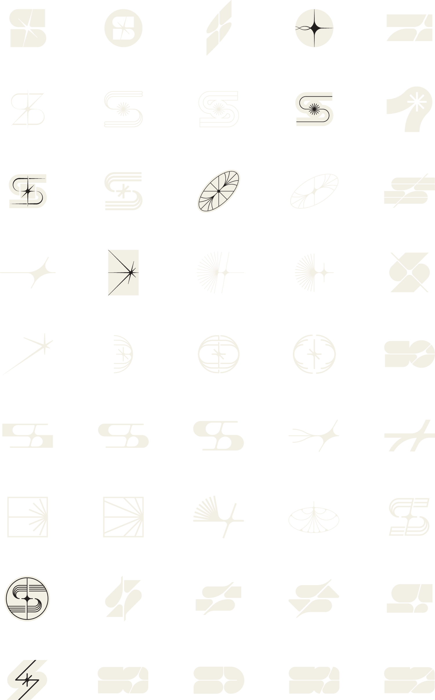
BRAND MARK EXPLORATION:
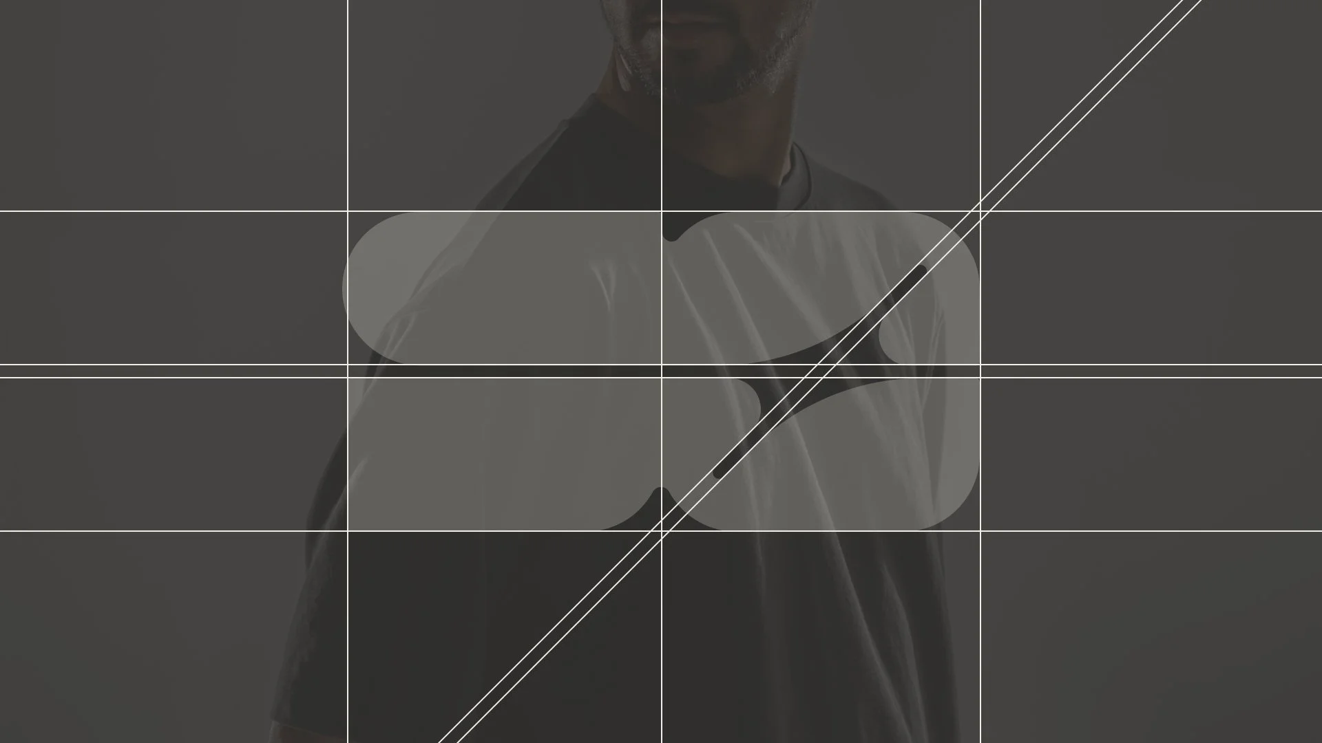
BRAND MARK CONSTRUCTION:
FINAL BRAND MARK :
EXPERIENTIAL BRANDING:
PRIMARY WORDMARK (LEFT-ALIGNED):

STICKER APPLICATION:
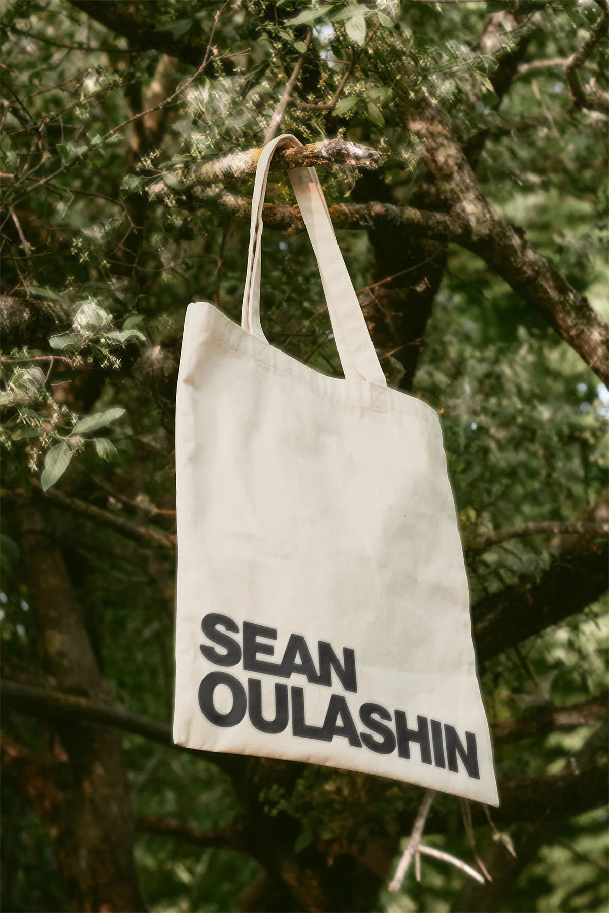
APPLIED WORDMARK:
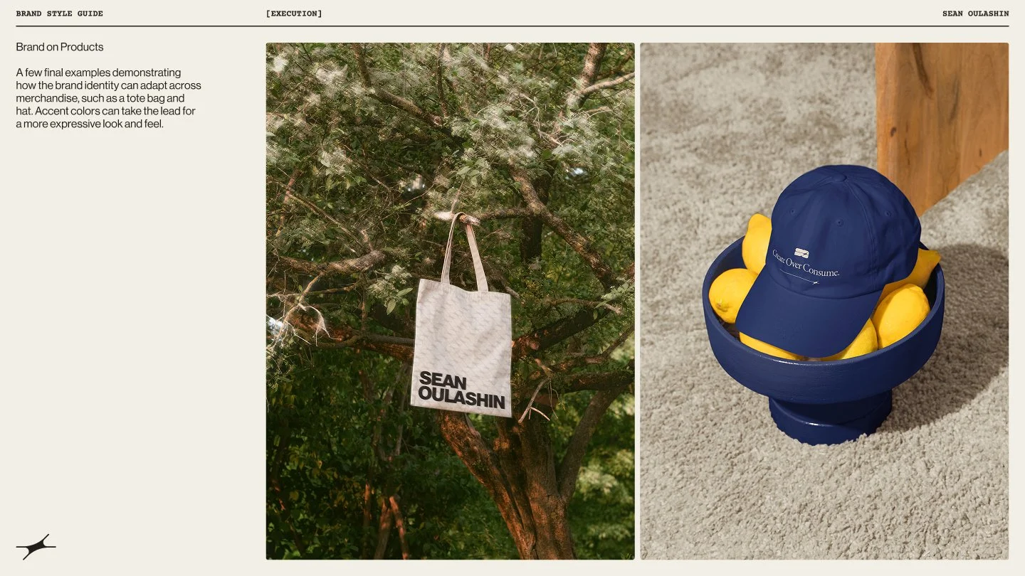
02. Visual Assets
The spark extends beyond the logo as a flexible graphic motif, allowing the brand to show up without always relying on the full mark. It adds direction and a subtle sense of energy to layouts.
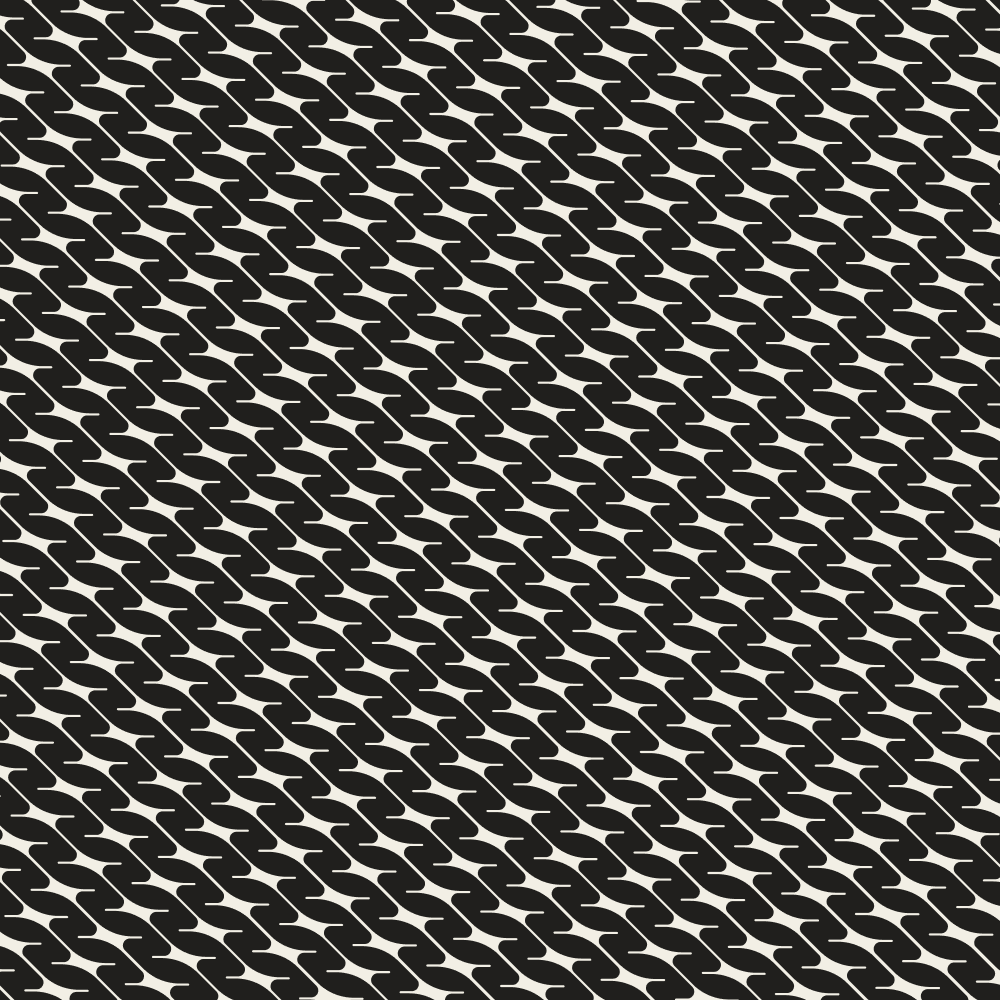
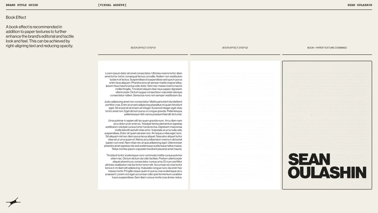
A custom pattern derived from the spark, paired with layered paper textures, introduces depth and tactility across applications.
THE SPARK:

THE SPARK (VARIABLE WIDTH):

BRAND PATTERN:


LOGO ON PATTERN:
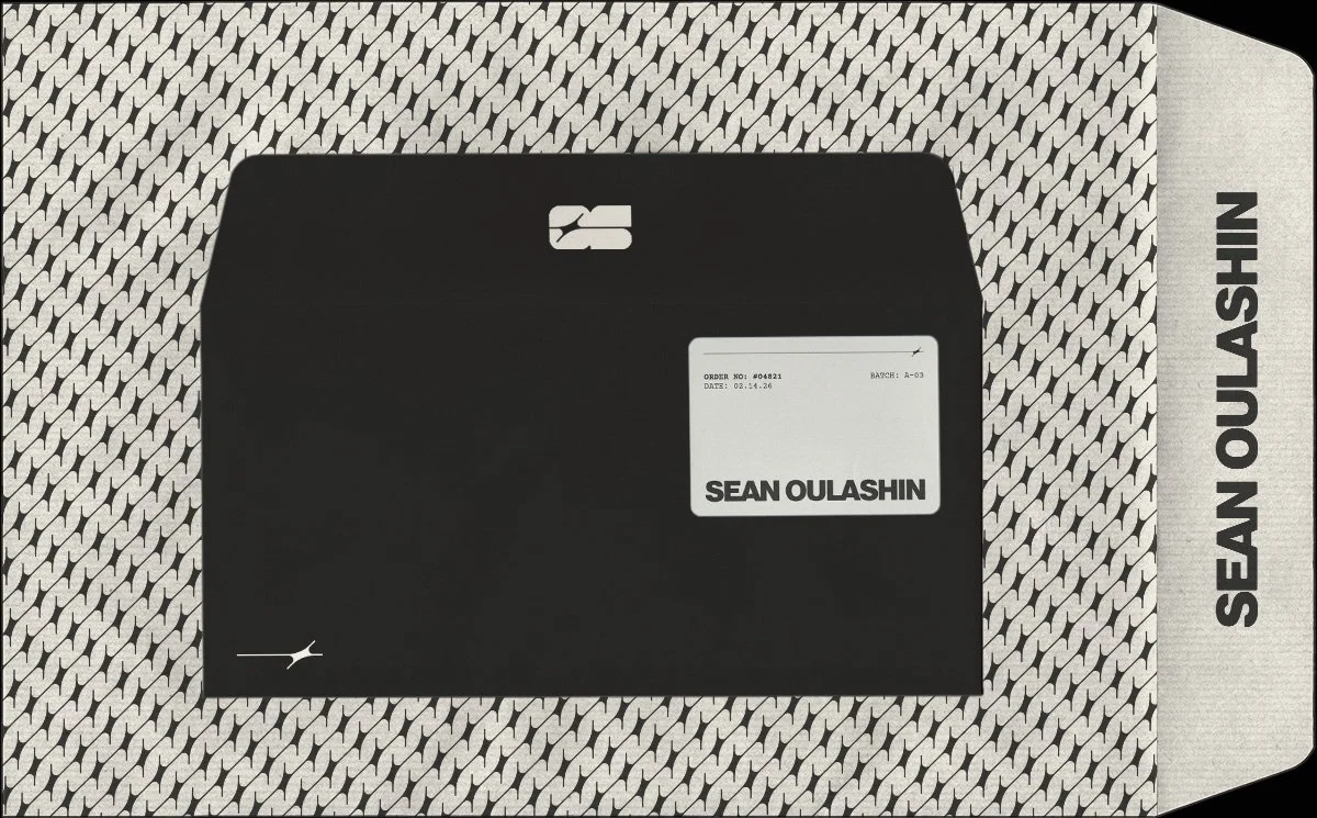
BRANDED STATIONARY:
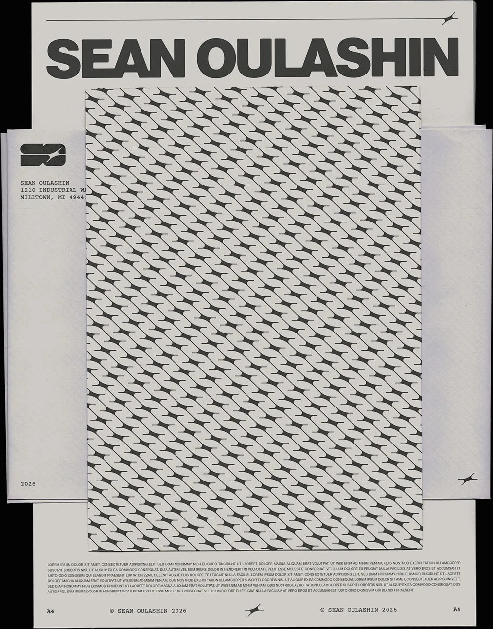
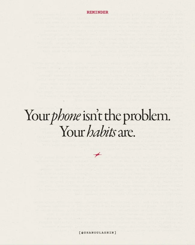
BOOK EFFECT TEXTURE:
TEXTURE IN CONTEXT (SOCIAL POST):
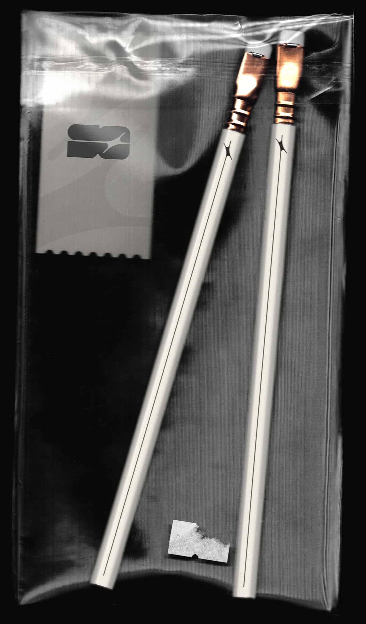
EXPERIENTIAL BRANDING (PENCILS):
BRANDED STATIONARY:
03. COlor & Type
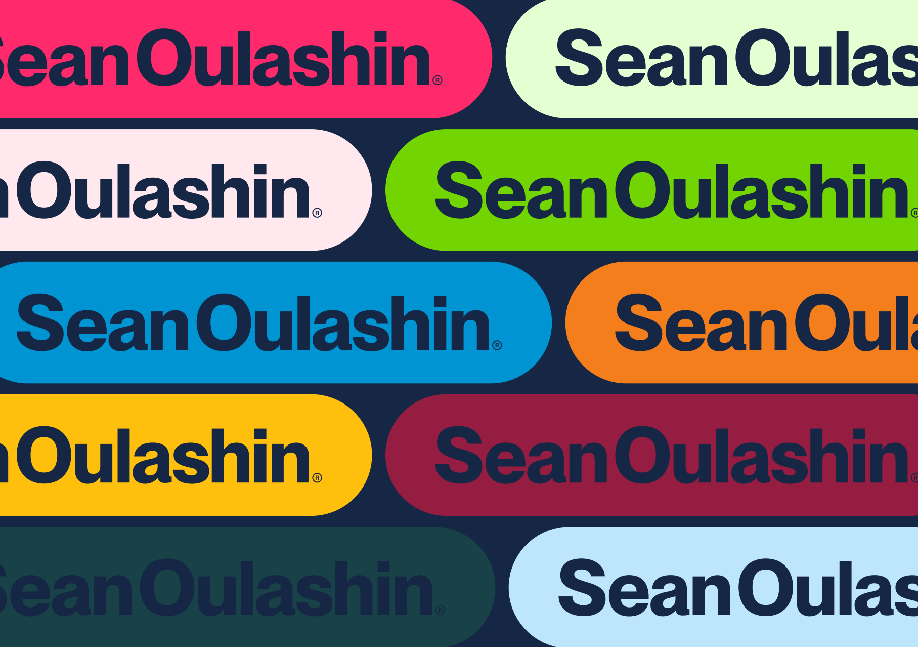
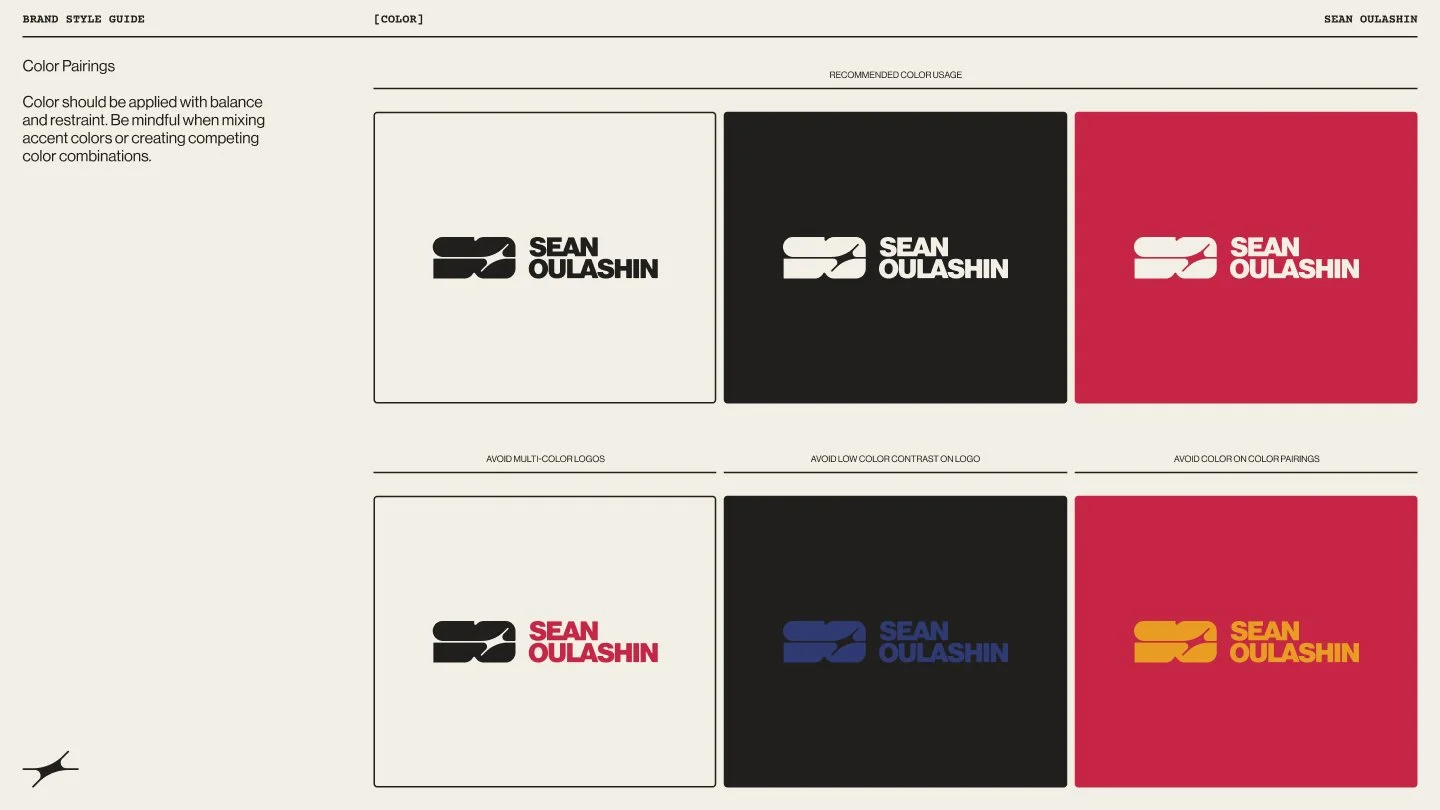
The palette is primarily monochrome while accent colors are used sparingly to highlight key moments without overwhelming the composition.
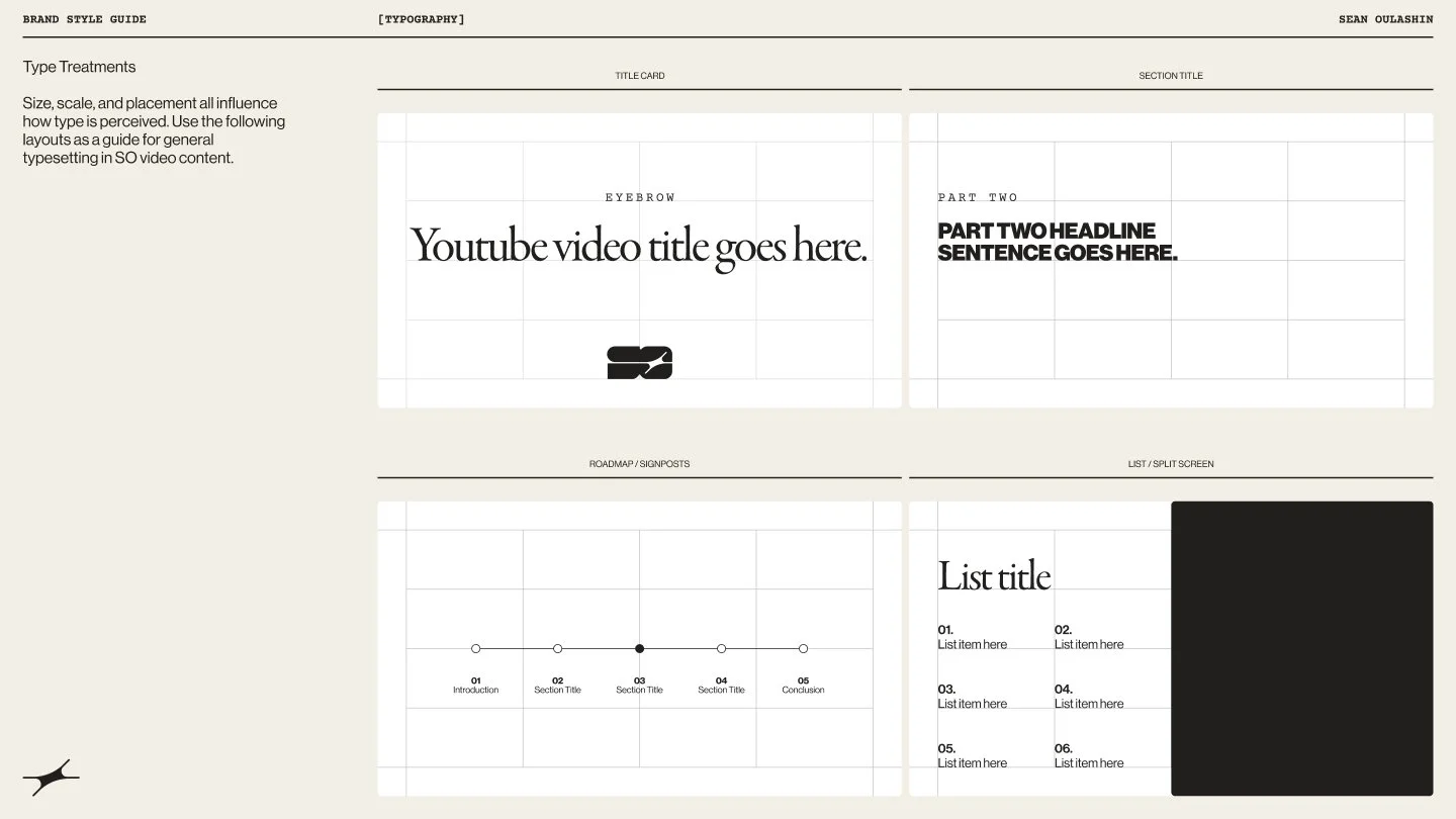
Typography plays a central role in shaping tone: Neue Haas Grotesk delivers bold, utilitarian clarity, Garamond Premiere Pro introduces warmth and humanity, and Courier Prime adds subtle, tactile detail. The combination creates hierarchy, rhythm, and a balance between structure and expression.
SO BLUE:
SO GREEN:


SO YELLOW:
SO RED:


SO BLACK:
SO WHITE:

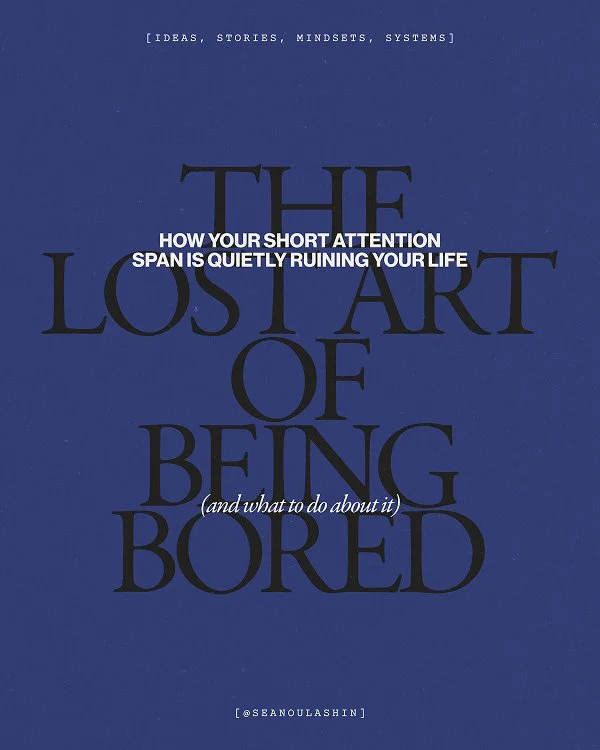
TYPE PAIRING & HIERARCHY 01:
TYPE PAIRING & HIERARCHY 02:
TYPE APPLICATION EXAMPLES:
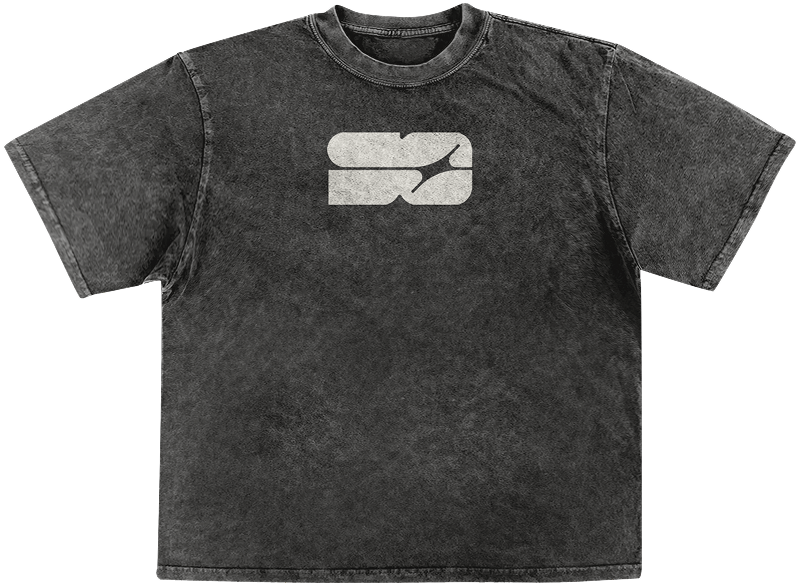
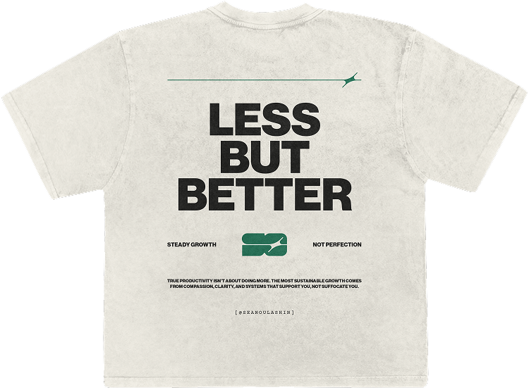
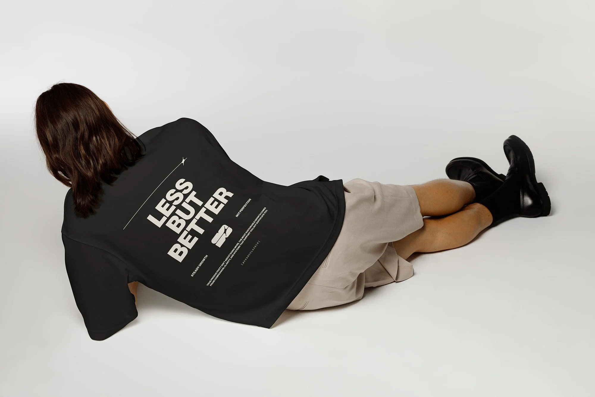
T-SHIRT DESIGN:
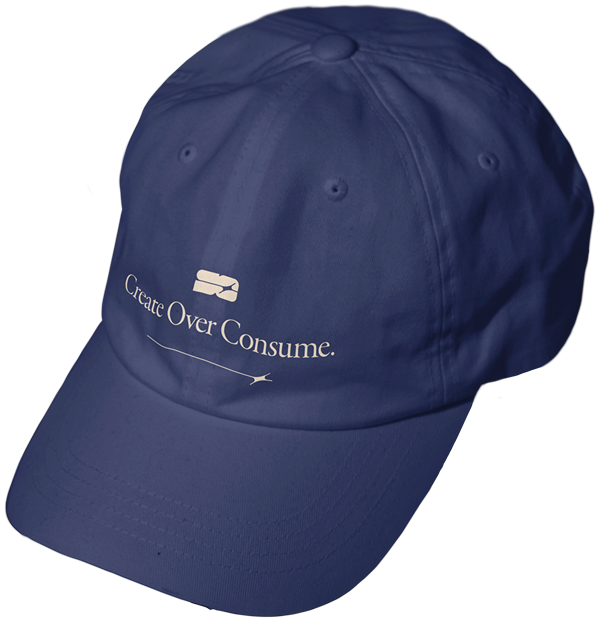
DAD HAT:
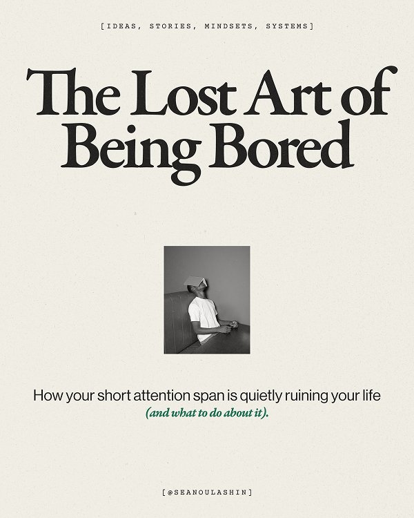
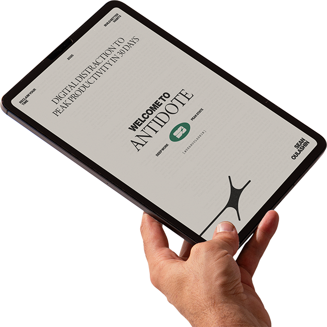
E-BOOK COVER:
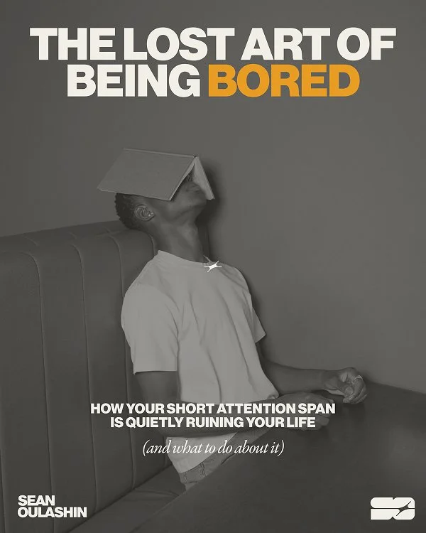
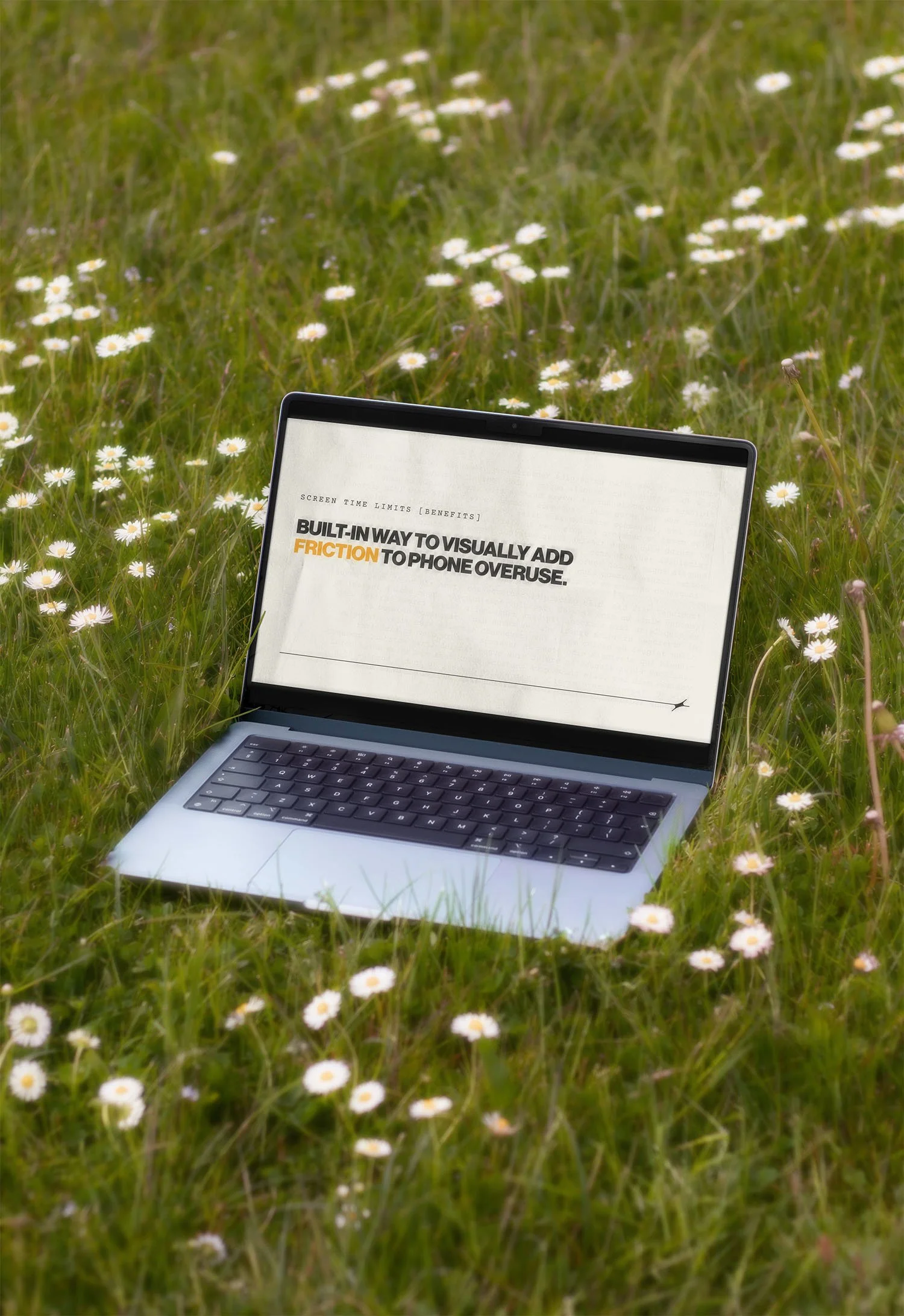
YOUTUBE VIDEO SECTION TITLE:
04. System & Standards
The brand is supported by a clear but flexible framework. Defined logo usage, grid structure, type hierarchy, and color balance ensure consistency across touchpoints. The system provides enough guidance to maintain cohesion while allowing the brand to evolve alongside Sean’s content.
STYLE GUIDE OVERVIEW:
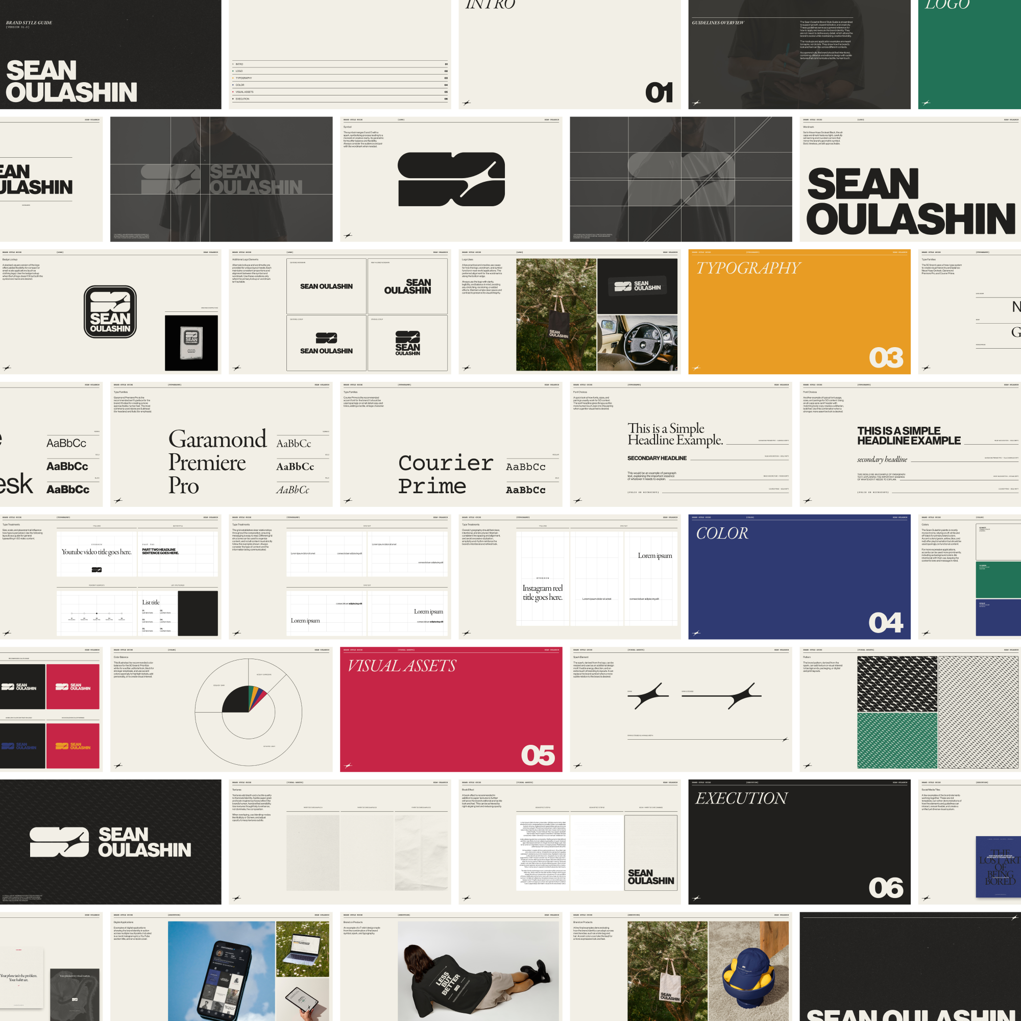
STYLE GUIDE HIGHLIGHTS:
QUICK REFERENCE STYLESHEET:
LAST LOOK

Explore MORE
MIDWAY GARDENS
Playing Cards
01. Back Design
02. Pips & Indices
03. Court Cards
04. Ace & Extra Cards
05. Assembly/Prepress