
ALEXANDER GIRARD:
AIRPLANE DESIGN:

Braniff Playing Cards
THE ASK:
Create a deck of playing cards that pays homage to Braniff's iconic era and its lasting impact on art, fashion, design, and travel.
BACKGROUND:
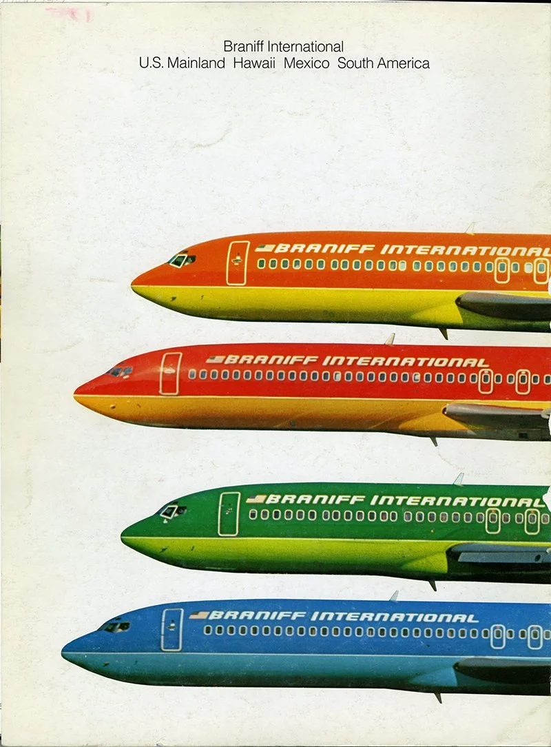
Braniff Airways was founded by two visionary brothers in Oklahoma City in 1927, and quickly soared to global heights, serving over 89 destinations worldwide. In 1965, Braniff kicked off the iconic “The End of the Plain Plane” campaign, spearheaded by graphic design legend Alexander Girard. Girard’s bold colors, rich fabrics, and mid-century modern designs revamped everything from the planes' exteriors to the brand's identity, making Braniff a trailblazer in the travel industry.
SUMMARY:
To pay homage to Braniff's iconic style, I used Girard's original designs as the foundation for every element of the deck. The back and tuck case designs are adapted from an original Girard graphic, the pips are crafted using the Braniff logo and bird, and the court cards feature textile patterns hand-picked by Girard for the airplane interiors. The result is a bold and timeless design that celebrates the airline's influence on art, fashion, design, and travel.
ACKNOWLEDGMENTS:
Creative Direction — Dan Buck
Product Photography — Art of Play
01. BACK DESIGN
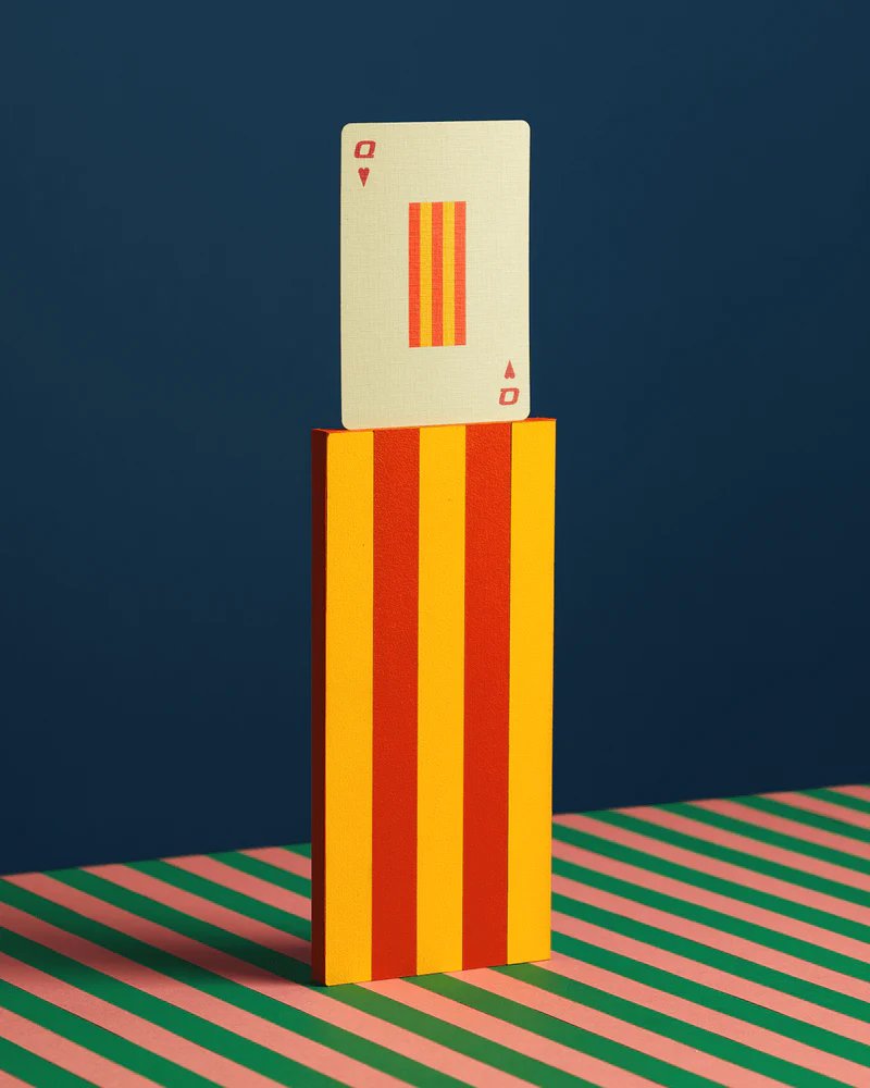
The back design features a minimal yet vibrant, geometric Girard graphic. The challenge was reformatting his original artwork to seamlessly fit a playing card’s dimensions. My goal was to make the design look like it was always meant to be on a playing card, perfectly complementing its shape.
ORIGINAL GIRARD DESIGN:

FINAL BACK DESIGN:

EXPLORATION:

02. PIPS
Designing the pips for this deck was for sure my favorite part of the process. To match Girard's visual style, I picked colors from his original palette and used the geometry of the Braniff logo and bird to construct each one. The result is a set of unique, retro pips that perfectly complement the Braniff aesthetic.
BRANIFF COLOR SWATCH:

PIP COLORS:

BRANIFF BIRD AND LOGO:

PIP CONSTRUCTION:


FINAL PIPS:

03. COURT CARDS
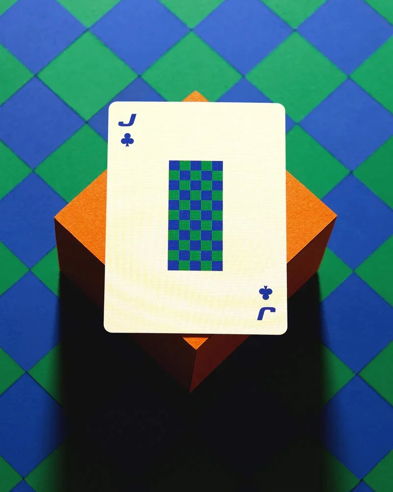
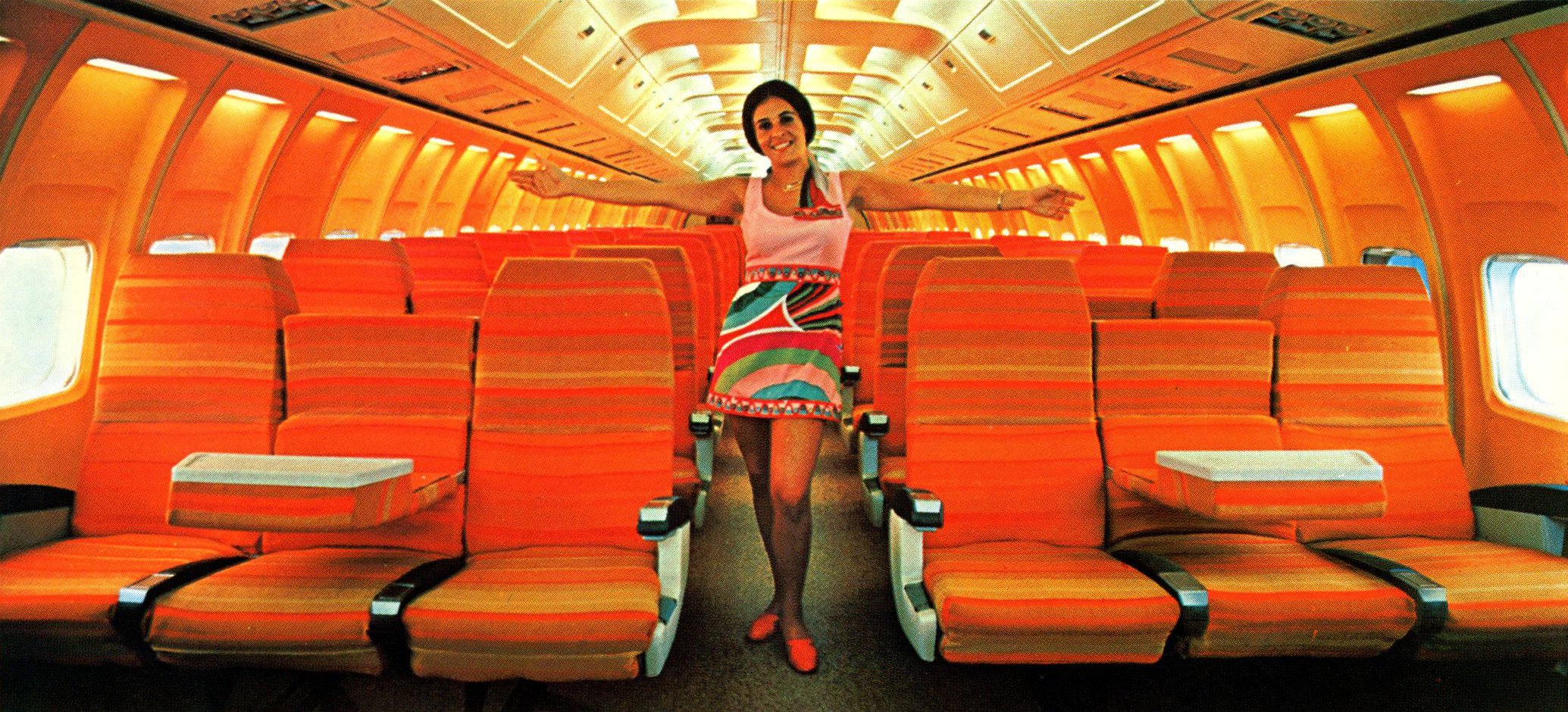
The court cards break from tradition; instead of the usual jacks, queens, and kings, they feature textile patterns chosen by Girard for the plane interiors. I went with this approach because the bold, geometric designs complement the card backs perfectly.
INTERIOR AIRPLANE DESIGN:

FINAL COURT CARDS:


EXPLORATION:

04. PACKAGING
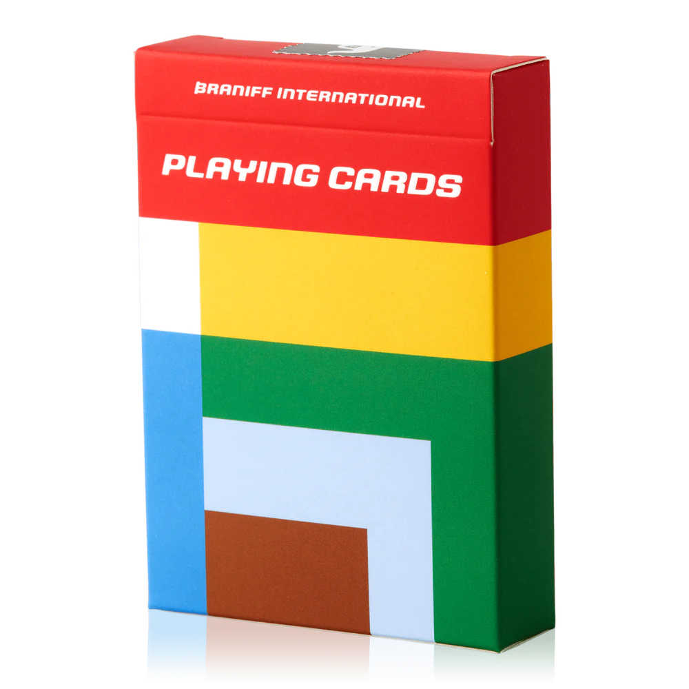
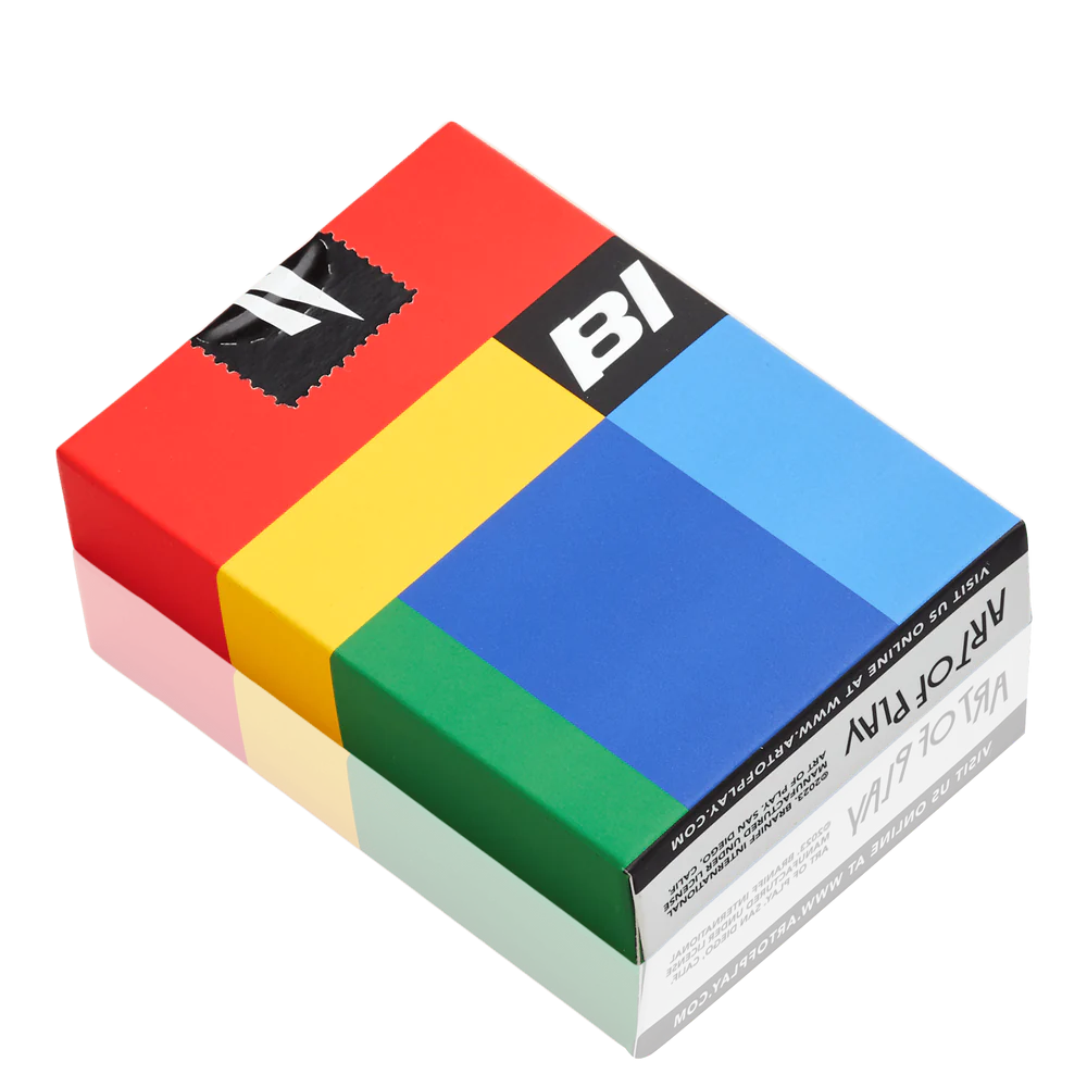
The tuck case design uses the same Girard graphic as the card backs, adapted to fit the box dimensions seamlessly. I left the top third of the tuck case as a solid red color block to provide some visual space for the copy and sticker seal, which features the Braniff bird set against a black background.
TUCK CASE DIELINE:

STICKER SEAL:

FINAL TUCK CASE:

05. ASSEMBLY/PREPRESS
The final step was to assemble and integrate all the individual design elements while prepping the deck for print. The pips are arranged in a non-traditional layout and are paired with Girard's custom Sky typeface. I also designed a pair of jokers featuring the Braniff bird, which compliment the geometric back design.
SPADES DIELINE:

DIAMONDS DIELINE:

CLUBS DIELINE:

HEARTS DIELINE:

BACK, JOKERS, AND EXTRA CARDS DIELINE:

LAST LOOK


